People think analytics is about getting the right answers. In truth, it’s about asking the right questions.
Analysts can find the answer to just about any question. So, the difference between a good analyst and a mediocre one is the questions they choose to ask. The best questions test long-held assumptions about what makes the business tick. The answers to these questions drive concrete changes to processes, resulting in lower costs, higher revenue, or better customer service.
Often, the obvious metrics don’t correlate with sought-after results, so it’s a waste of time focusing on them, says Ken Rudin, general manager of analytics at Zynga and a keynote speaker at TDWI’s upcoming BI Executive Summit in San Diego on August 16-18.
Challenge Assumptions
For instance, many companies evaluate the effectiveness of their Web sites by calculating the number of page hits. Although a standard Web metric, total page hits often doesn’t correlate with higher profits, revenues, registrations, or other business objectives. So, it’s important to dig deeper, to challenge assumptions rather than take them at face value. For example, a better Web metric might be the number of hits that come from referral sites (versus search engines) or time spent on the Web site or time spent on specific pages.
TDWI Example. Here’s another example closer to home. TDWI always mails conference brochures 12 weeks before an event. Why? No one really knows; that’s how it’s always been done. Ideally, we should conduct periodic experiments. Before one event, we should send a small set of brochures 11 weeks beforehand and another small set 13 weeks prior. And while we’re at it, we should test the impact of direct mail versus electronic delivery on response rates.
These types of analyses don’t take sophisticated mathematical software and expensive analysts; just time, effort, and a willingness to challenge long-held assumptions. And the results are always worth the effort; they can either validate or radically alter the way we think our business operates. Either way, the information impels us to fine-tune or restructure core business processes that can lead to better bottom-line results.
Analysts are typically bright people with strong statistical skills who are good at crunching numbers. Yet, the real intelligence required for analytics is a strong dose of common sense combined with a fearlessness to challenge long-held assumptions. “The key to analytics is not getting the right answers,” says Rudin. “It’s asking the right questions.”
Posted by Wayne Eckerson0 comments
In her presentation on “BI Roadmaps” at TDWI’s BI Executive Summit last month, Jill Dyche explained that BI teams can either serve as “data providers” or “solutions providers.” Data providers focus on delivering data in the form of data warehouses, data marts, cubes, and semantic layers that can be used by BI developers in the business units to create reports and analytic applications. Solutions providers, on the other hand, go one step further, by working hand-in-hand with the divisions to develop BI solutions.
I firmly believe that BI teams must evolve into the role of solutions provider if they want to succeed long term. They must interface directly with the business, serving as a strategic partner that advises the business on how to leverage data and BI capabilities to solve business problems and capitalize on business opportunities. Otherwise, they will become isolated and viewed as an IT cost-center whose mission will always be questioned and whose budget will always be on the chopping block.
Data Provisioning by Default. Historically, many BI teams become data providers by default because business units already have reporting and analysis capabilities, which they’ve developed over the years in the absence of corporate support. These business units are loathe to turn over responsibility for BI development to a nascent corporate BI group that doesn’t know its business and wants to impose corporate standards for architecture, semantics, and data processing. Given this environment, most corporate BI teams take what they can get and focus on data provisioning, leaving the business units to weave gold out of the data hay they deliver.
Mired Down by Specialization
However, over time, this separation of powers fails to deliver value. The business units lose skilled report developers, and they don’t follow systematic procedures for gathering requirements, managing projects, and developing software solutions. They end up deploying multiple tools, embedding logic into reports, and spawning multiple, inconsistent views of information. Most of all, they don’t recognize the data resources available to them, and they lack the knowledge and skills to translate data into robust solutions using new and emerging BI technologies and techniques, such as OLAP cubes, in-memory visualization, agile methods, dashboard, scorecards, and predictive analytics.
On the flip side, the corporate BI team gets mired down with a project backlog that it can’t seem to shake. Adopting an industrialized assembly line mindset, it hires specialists to handle every phase of the information factory to improve efficiency (e.g. requirements, ETL, cube building, semantic modeling, etc.) yet it can’t accelerate development easily. Its processes have become too rigid and sequential. When divisions get restless waiting for the BI team to deliver, CFOs and CIOs begin to question their investments and put its budget on the chopping block.
Evolving into Solutions Providers
Rethink Everything. To overcome these obstacles, a corporate BI team needs to rethink its mission and the way it’s organized. It needs to actively engage with the business and take some direct responsibility for delivering business solutions. In some cases, it may serve as an advisor to a business unit which has some BI expertise while in others it may build the entire solution from scratch where no BI expertise exists. By transforming itself from a back-office data provider to a front-office solutions developer, a corporate BI team will add value to the organization and have more fun in the process.
It will also figure out new ways to organize itself to serve the business efficiently. To provide solutions assistance without adding budget, it will break down intra-organizational walls and cross-train specialists to serve on cross-functional project teams that deliver an entire solution from A to Z. Such cross-fertilization will invigorate many developers who will seize the chance to expand their skill sets (although some will quit when forced out of their comfort zones). Most importantly, they will become more productive and before long eliminate the project backlog.
A High Performance BI Team
For example, Blue Cross/Blue Shield of Tennessee has evolved into a BI solutions provider over the course of many years. BI is now housed in an Information Management (IM) organization that reports to the CIO and is separate from the IT organization. The IM group consists of three subgroups: 1) the Data Management group 2) the Information Delivery group and 3) the IM Architecture group.
- The Data Management group is comprised of 1) a data integration team that handles ETL work and data warehouse administration and 2) a database administration team that designs, tunes, and manages IM databases.
- The Information Delivery group consists of 1) a BI and Performance Management team which purchases, installs, and manages BI and PM tools and solutions and provides training and two customer-facing solutions delivery teams that work with business units to build applications. The first is the IM Health Informatics team that builds clinical analytic applications using reporting, OLAP, and predictive analytics capabilities, and the second is the IM Business Informatics team which builds analytic applications for other internal departments (i.e. finance, sales, marketing).
- The IM Architecture group builds and maintains the IM architecture, which consists of the enterprise data warehouse, data marts, and data governance programs, as well as closed loop processing and the integration of structured and unstructured data.
Collaborative Project Teams. Frank Brooks, director of data management and information delivery at BCBS of Tennessee, says that the IM group dynamically allocates resources from each IM team to support business-driven projects. Individuals from the Informatics teams serve as project managers, interfacing directly with the customers. (While Informatics members report to the IM group, many spend most of their in the departments they serve.) One or more members from each of the other IM teams (data integration, database administration, and BI/PM) is assigned to the project team and they collaboratively work to build a comprehensive solution for the customer.
In short, the BI team of BCBS of Tennessee has organized itself as a BI solutions provider, consolidating all the functions needed to deliver comprehensive solutions in one group, reporting to one individual who can ensure the various teams collaborate efficiently and effectively to meet and exceed customer requirements. BCBS of Tennessee has won many awards for its BI solutions and will be speaking at this summer’s TDWI BI Executive Summit in San Diego (August 16-18.)
The message is clear: if you want to deliver value to your organization and assure yourself a long-term, fulfilling career at your company, then don’t be satisfied with being just a data provider. Make sure you evolve into a solutions provider that is viewed as a strategic partner to the business.
Posted by Wayne Eckerson0 comments
TDWI’s Maturity Model is represented by a bell curve spanning five stages of maturity. The curve, which represents the percentage of companies at each stage, is broken in two spots. The first is the Gulf and the second is the Chasm. (See figure 1.)
The Gulf and Chasm represent the series of obstacles and challenges that early- and later-stage programs encounter during their BI journey, respectively. Companies in the Gulf struggle with sponsorship, funding, data quality, project scope, and spreadmarts. Companies in the Chasm struggle with the politics, logistics, and dynamics of delivering an enterprise BI environment. (An enterprise environment may span the entire organization, a business unit, or profit-loss center.)
While the Gulf is difficult, the Chasm is downright perilous. Many BI programs fall into the Chasm and are never heard from again. During the next several weeks, I’ll write a series of blog posts designed to help BI professionals better understand the hazards of the Chasm and how to overcome them.
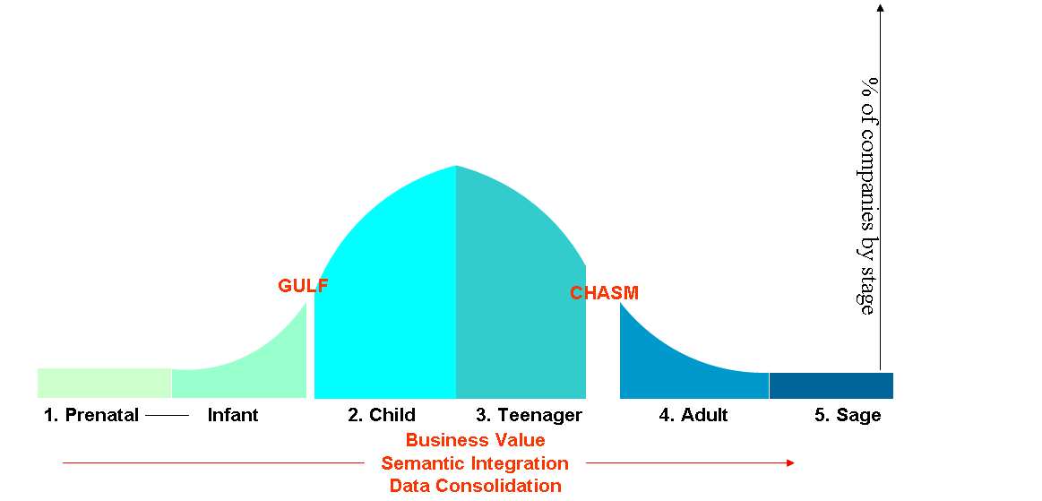
Figure 1.
From Cost-Savings to Strategic Value
The first major challenge that companies face in the Chasm is re-justifying their existence. By now, the BI team has squeezed all the cost-efficiencies out of the reporting process and must justify itself by the strategic value it offers the organization. Executives funded early data warehousing projects in part because of the projected ROI from consolidating legacy reporting systems and freeing high-priced analysts from having to manually create standard weekly or monthly reports.
Now, the BI program must do more than reduce costs and streamline IT processes. It needs to become a mission-critical resource that executives see as critical to the company’s growth. This is especially true if BI represents a sizable portion of the IT budget and employs more than a handful of full-time staffers. With a six- or seven-figure budget, the BI program has a huge bulls-eye on its back during budget season. To address the question, “What has BI done for us lately?” the BI team must have a ready and compelling answer.
Astute BI directors craft a vision for BI in business language and peddle it constantly. More than pitching proverbial “single version of truth,” they discuss how BI is critical to understanding the profitability of every customer or every product and how this information drives critical decisions about how the company invests its time, resources, and money. They talk about how BI is critical to achieving a 360-degree view of customers or suppliers and how that information has increased revenues and decreased procurements costs, respectively.
Savvy BI directors also discuss how BI is bridging the barriers between departments. For example, they talk about how finance directors and operations managers can speak the same language because general ledger data is aligned with product sales at a detailed level. They also show the company’s performance has improved since the BI team started displaying metrics with detailed, supporting data within easy-to-use dashboards and scorecards.
Talking the Talk
Of course, BI managers won’t have much to talk about if they haven’t done these or other strategic initiatives. But at least they can relay the vision they are working on, and bank on goodwill until they have tangible results to show.
But even “talking the talk” can be a stretch for some BI managers who grew up in IT with a technological perspective of the business. Thus, the first key to crossing the chasm is understanding the business and developing a strong rapport with business executives and managers by framing BI in their context.
Stay tuned for a description of the other major challenges facing companies in the Chasm in future posts.
Posted by Wayne Eckerson0 comments
Next year marks the 15th anniversary of TDWI, an association of data warehousing and business intelligence (BI) professionals that has grown nearly as fast as the industry it serves, which now tops $9 billion according to Forrester Research.
In 1995, when data warehousing was just another emerging information technology, most people—including some at TDWI—thought it was just another tech fad that would fade away in a few short years like others before it (e.g. artificial intelligence, computer-assisted software engineering, object-relational databases.) But data warehousing’s light never dimmed, and it has evolved rapidly to become an indispensable management tool in well-run businesses. (See figure 1.)
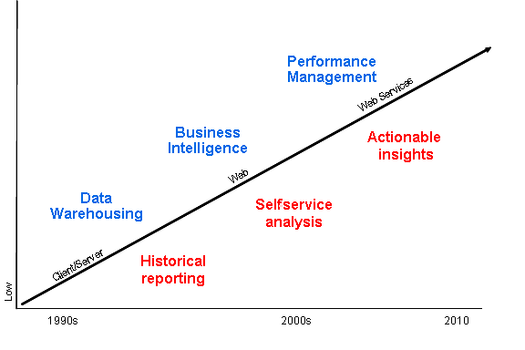 Figure 1. As data warehousing has morphed into business intelligence and performance management, its purpose has evolved from historical reporting to self-service analysis to actionable insights. At each step along the way, its business value has increased.
In the beginning…
In the early days, data warehousing served a huge pent up need within organizations for a single version of corporate truth for strategic and tactical decision making and planning. It also provided a much needed, dedicated repository for reporting and analysis that wouldn’t interfere with core business systems, such as order entry and fulfillment.
What few people understood then was that data warehousing was the perfect, analytical complement to the transaction systems that dominated the business landscape. While transaction systems were great at “getting data in,” data warehouses were great at “getting data out” and doing something productive with it, like analyzing historical trends to optimize processes, monitoring and managing performance, and predicting the future. Transaction systems could not (and still can’t) do these vitally important tasks.
Phase Two: Business Intelligence
As it turns out, data warehousing was just the beginning. A data warehouse is a repository of data that is structured to conform to the way business users think and how they want to ask questions of data. (“I’d like to see sales by product, region and month for the past three years.”)
But without good tools to access, manipulate, and analyze data, users can’t drive much value from the data warehouse. So organizations began investing in easy-to-use reporting and analysis tools that would empower business users to ask questions of the data warehouse in business terms and get answers back right away without having to ask the IT department to create a custom report. Empowering business users to drive insight from data using self-service reporting and analysis tools became known as “business intelligence.”
Phase Three: Performance Management
Today, organizations value insights but they want results. Having an “intelligent” business (via business intelligence) doesn’t do much good if the insights don’t help it achieve its strategic objectives, such as growing revenues or increasing profits. In other words, organizations want to equip users with proactive information to optimize performance and achieve goals.
Accordingly, business intelligence is now morphing into performance management where organizations harness information to improve manageability, accountability, and productivity. The vehicles of choice here are dashboards and scorecards that graphically depict performance versus plan for companies, divisions, departments, workgroups and even individuals. In some cases, the graphical “key performance indicators” are updated hourly so employees have the most timely and accurate information with which to optimize the processes for which they are responsible.
Organizations have discovered that publishing performance among peer groups engenders friendly competition that turbocharges productivity. But more powerfully, these tools empower individuals and groups to work proactively to fix problems and exploit opportunities before it is too late. In this way, performance management is actionable business intelligence built on a single version of truth delivered by a data warehousing environment.
The Future
As Timbuk3 once sung, “The future looks so bright I have to wear shades.” The same could be said of business intelligence as it increasingly becomes a powerful tool for business executives to measure, monitor, and manage the health of their organizations and keep them on track towards achieving strategic goals.
Posted by Wayne Eckerson0 comments
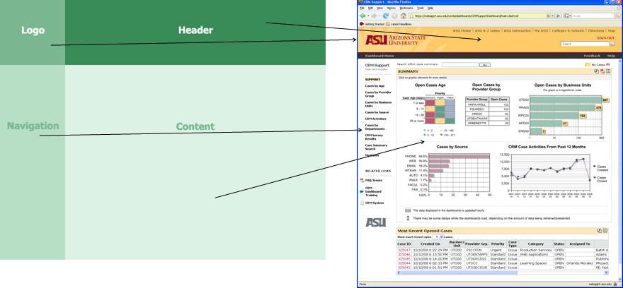
How do you deliver dashboards that end users will adopt and use? That was the gist of the insightful and humorous presentation titled “Dashboards to Die For” delivered by John Rome, Associate Vice President in the Technology Office at Arizona State University (ASU), at TDWI’s BI Executive Summit in San Diego earlier this month.
ASU’s dashboard project started with a memo from the University’s president to the CIO, Adrian Sannier, Rome’s boss, that said “Adrian, learn all you can about Dashboards and then see me.” (See figure 1.) With a data warehouse already in place, the dashboards would be instrumental in driving usage to higher levels, making BI pervasive, according to Rome.
Figure 1.

The data warehouse already contained most of the data so ASU only needed a flexible development tool and design principles to put the icing on the cake. It chose a dashboard tool from Corda Technologies which enabled it to create dashboards quickly by pulling data from any system, including the data warehouse. It then consulted a few dashboard and design experts, including Edward Tufte, Stephen Few, and yours truly.
Four years later, ASU has deployed dozens of dashboards in multiple departments and now has its own tips and techniques for delivering user-friendly and powerful dashboards. Here are a few of John’s recommendations:
<!--[if !supportLists]-->
- Embed dashboards as a link within the corporate portal so users have one click access to the information
- The best screen size for the dashboard window is 1024 x 768
- Place the most important elements for viewing in the upper left hand corner and the least important in the lower right corner to mimic the way the eye scans a page.
- Avoid decorative dashboard elements, like dials, gauges, and images and cluttering the screen with images and color.
- Design your dashboard pages to mimic popular Web layouts.
- Create a summary screen of the most important information. (See figure 2.)
Figure 2.
- Place elements on the screen so users don’t have to scroll.
- Add a “design tip” logo that users can click to get techniques about using the displayed elements and offer an online help center that provides a directory of topics for using the dashboards.
- Avoid pie charts, 3-D elements, and gradient shading.
- Accommodate color blindness.
- Accent key variables with subtle hues or patterns. See figure 3.
Figure 3. From
The Dashboard Spy. 
- My favorite: “Power comes with interaction/drills.”
- Make dashboards actionable. Here ASU has bidirectionally linked its dashboards to various operational systems, such as its PeopleSoft HR system, so authorized users can update the status of employees, classes, students, professors, etc.
- Use non-serif fonts and 12 point text for the main body and smaller fonts for supplementary text.
- Provide metadata about metrics, including SQL used. Offering screen cams and FAQs also helps.
- Use ranking to help users assess key elements within the data and to promote friendly competition among peer groups.
- Use charts rather than tables.
- Abbreviate numbers appropriately, so that $13,002,000 is $13M
- Perform usability studies to understand how users interact with the dashboard.
- Customize the dashboards by role.
Of all the design tips, the most powerful are to make the dashboards drillable, actionable, and instantly informative. ASU has put a lot of time and thought into the design and delivery of its dashboards and the effort has paid off. But don’t just take my word for it; check out ASU’s public dashboard Web site where you can get more information about the dashboards used at the University: http://dashboard.asu.edu.
Posted by Wayne Eckerson0 comments
More than 70 business intelligence directors and sponsors gathered in San Diego this week for the TDWI’s semi-annual BI Executive Summit. The executives were enlightened by a mix of case studies (NetApp, Dell, Arizona State University, RBC Wealth Management, and ShareThis) and educational sessions on key areas of interest (BI in the Cloud, change management, cost estimating BI projects, Hadoop, visualization, BI mashups, social intelligence, pervasive BI, and the future of BI.)
The attendees also voted on technologies and programs that will be of key interest to them in the next three years. Topping the technology chart were predictive and in-database analytics, dashboards, visualization, the cloud, and operational BI. On the process side, key initiatives will be data quality and governance, business process management, and BI competency centers.
The event’s sponsors also chimed in during sessions and the future of BI panel. Teradata discussed active data warehousing, Information Builders showed how to integrate strategic, tactical, and operational BI, Birst discussed the benefits of cloud-based computing via its customer RBC Wealth, Sybase discussed in-database analytics via SQL-based plug-ins from Fuzzy Logix, and IBM discussed innovations in BI, such as search, collaboration, and mashups.
Most attendees valued the networking and collaboration that the event offers during lunch and breaks. In addition, hands-on workshops put the attendees in the drivers seat. During the Dell case study, attendees were given a real-life scenario of Dell’s data warehousing environment circa 2007 and then in groups had to decide how they would have approached the issues that Dell faced. After considerable discussion and debate, representatives from Dell—who were actively taking notes during the discussion phase—told the audience how they approached the situation. The workshop on change management also asked the attendees to work in small groups to discuss the implications of the FEE (fear, entitlement, earning.)
Quotable Quotes from the event:
- “You typically only need 12 metrics to run a company.” Tony Politano, consultant and author of Chief Performance Officer
- “Our dashboards, which are all built on the same platform and enterprise model, provide enterprise, functional, and role based views of information.” Dongyan Wang, NetApp
- “We designed the dashboard so that any user could get any information they want at any level of detail in three clicks.” Dongyan Wang, NetApp
- “A dashboard should provide more than composite views of information; they should allow users to create a personalized mashup via Web services and widgets so the environment caters to their needs.” Laura Edell Gibbons
- “Add a top 10 list to your portal to enhance usage and pay attention to principles of visual design.” John Rome, Arizona State University
- “We inventoried our spreadmarts and found we had about 40,000 around the world and that didn’t even count spreadsheets.” Rob Schmidt, Dell
- “It’s important to pick data governance decision makers at the right level; we had Michael Dell’s direct reports.” Mike Lampa, Dell
- “The initial response of the business units to the decision to shift analysts who spent most of their time creating reports into IT was ‘Go to hell!’ But quickly, the saw that the move would free up budget dollars and headcount for them and they bought into the decision.” Mike Lampa, Dell
- “One lesson learned [during the Dell DW renovation] was losing sight of the importance of delivering value while establishing and enforcing enterprise standards.” James Franklin, Dell
- “Our BI architectures are rooted in outdated assumptions of resource scarcity.” Mark Madsen, Third Nature
- “Because of advances in processing and storage power, we could now ship the data warehouse that I built in 1993 for $1.5 million on a laptop to every individual in the company.” Mark Madsen, Third Nature
Posted by Wayne Eckerson0 comments
While teaching a course on performance dashboards recently, I had a minor epiphany. The reason key performance indicators (KPIs) are so difficult to create is because you need a degree in sociology to predict the impact they will have on human and organizational behavior. My advice to the class was: Don’t try to design perfect KPIs on the first try; rather put them in play, see what behaviors they drive—both good and bad—and then adjust quickly.
Interpreting KPIs. The first challenge with KPIs is that without adequate training and socialization people will interpret results differently. For example, if a KPI’s status is red but its trend is positive, what should a user think? Perhaps, someone already spotted the problem and applied a remedy which is now working. Conversely, what if a KPI’s status is green but its trend is downward? A green light indicates performance is above average, but should you take action now before the green light turns yellow? Tools that let users annotate KPIs can help users take the right action and teach novices how the company works.
Driving Behavior. The second challenge with KPIs is using them to drive right behaviors. If we apply incentives to KPIs—such as attaching merit pay to performance measured by the KPIs—we in effect are conducting a giant sociology experiment. Since humans are irascible creatures embedded in complex (daresay dysfunctional) organizational systems, understanding the true impact of KPIs is impossible to predict.
The mistake most KPI teams make is focusing on one behavior at the expense of another that is outside their purview. For example, call center executives who want to boost productivity may create a metric that rewards agents for the number of calls taken per hour. Incented by this metric, agents will be tempted to terminate calls or transfer them to other departments without resolving them. This will have a dramatic affect customer satisfaction, which may be the responsibility of another team. Higher-level executives need to intervene and make sure a counterbalancing metric is introduced that rewards agents for both productivity and first-time call resolution.
KPI Ecosystems. KPI design teams need to think of KPI ecosystems. Although two metrics may conflict with each other by driving contradictory behavior, this is ok. In a strange way, this conflict empowers workers to make judicious decisions. Humans have a great capacity to live in and reconcile the tension between two opposites (although not without some anxiety.) With strong leadership and proper training, employees can effectively balance countervailing metrics.
Buy In. It’s also imperative that you get workers’ input before you implement incentive-based metrics. That’s because workers understand the nuances of the processes being measured and can identify whether the metrics are realistic and attainable and any potential loopholes that unscrupulous workers might exploit. Putting metrics out for broad-based review helps ensure the buy in of the people whose behavior you are trying to measure and change.
Defining KPIs is a sociology experiment and your workers are the test subjects. Treat them with respect, and your experiment has a better chance of success. But remember, it is an experiment, and if it fails, that’s part of the process. Refine the metrics and try again until you get it right.
For more information on designing effective metrics, see Wayne’s report titled “Performance Management Strategies: How to Create and Deploy Effective Metrics.”
Posted by Wayne Eckerson0 comments
America’s biggest problem today is glut. The recession notwithstanding, we are saturated with stuff. I was heartened to read in the Wall Street Journal recently that supermarkets and discount retailers are cutting back on the number of items per category and brand that they carry. For example, Walgreen Co. is cutting back the number of superglues it carries from 25 to 11. Of course, 11 items is still an over-abundance but at least it’s a start.
We are also drowning in data. We’ve established personal coping mechanisms (or not) to deal with a never ceasing stream of email, direct mail, voice mail messages. But we are still vulnerable to the glut of metrics that our companies spit at us through an endless variety of reports. To cope, some largely ignore the data, making decisions based on gut instincts, while others pluck numbers from various reports and insert them into a personalized spreadsheet to do their analysis. Dashboards put a pretty face on metrics but often don’t do enough to slice through the tangle.
Strategy rolls down, and metrics roll up.
To deal with the glut of metrics, we need to take a step back and understand what we are trying to accomplish. Executives need to identify a handful of strategic objectives and devise metrics to measure progress against them. Each of these high-level metrics then cascades into additional metrics at each successive level of the organization. Each metric supports processes at an increasingly granular level and is tailored to a small number of employees who are accountable for its results. Activity at each level is then aggregated to deliver an enterprise view. In this way, strategy rolls down and metrics roll up.
The Power of One. So what is the right number of strategic metrics? One targeted metric may be all that is needed. British Airways reportedly turned itself around in the 1980s by focusing a single metric: the timely arrival and departure of airplanes. The CEO personally called any airport manager when a British Airways plane was delayed over a certain time to discover the reason for the hold up. The metric and the threat of a call from the CEO triggered a chain reaction of process improvements throughout the organization to ensure the event did not repeat itself.
Consequently, the airline reaped sizable benefits: it reduced costs involved in reaccommodating passengers who would have missed connecting flights and it avoided alienating those customers; it improved the moral of employees who no longer had to deal with angry or upset passengers; and it improved the performance of suppliers and partners who no longer had to rejigger schedules.
Ideally, employees each track about 3 to 7 metrics, each of which supports one or more high-level metrics. This is a reasonable number of manage and about the maximum number of things an individual can focus on effectively. More than that and the metrics lose their punch. Collectively, the organization may still have thousands of metrics it needs to track but all emanate from one—or more realistically about three to five strategic objectives which translate into 10 to 20 high-level metrics.
Thus, an effective dashboard strategy starts with defining strategic objectives and the metrics that support them. Dashboard designers should remember that less is more when creating performance metrics.
For more information on designing effective metrics, see Wayne’s report titled “Performance Management Strategies: How to Create and Deploy Effective Metrics.”
Posted by Wayne Eckerson0 comments
The BI/DW market has flowed quite independently for more than a decade, but increasingly it’s converging with other software streams, including ERP, MDM, search, and content management. This makes for an exciting, if not confusing, marketplace.
For example, what does BPM stand for? Business performance management or business process management? Well, technically it stands for both, but the identical acronyms have caused heartburn for those who have tried to evangelize, analyze, buy, or sell software in these two rapidly converging domains.
Helge Hess, SVP of Product and Solution Marketing at Germany-based IDS Scheer, shines a clear light on the space. He uses the term “process intelligence” to describe software that visualizes and analyzes how well business processes execute. I like the term. It reflects the growing convergence of process management and business intelligence yet creates a distinct identity for this emerging class of software.
For example, IDS Scheer’s ARIS Process Performance Manager, which shipped six years ago and is used by 300 customers, helps managers evaluate the performance of core processes and understand the root causes of highlighted problems and inefficiencies, according to Hess. (See figure 1.)
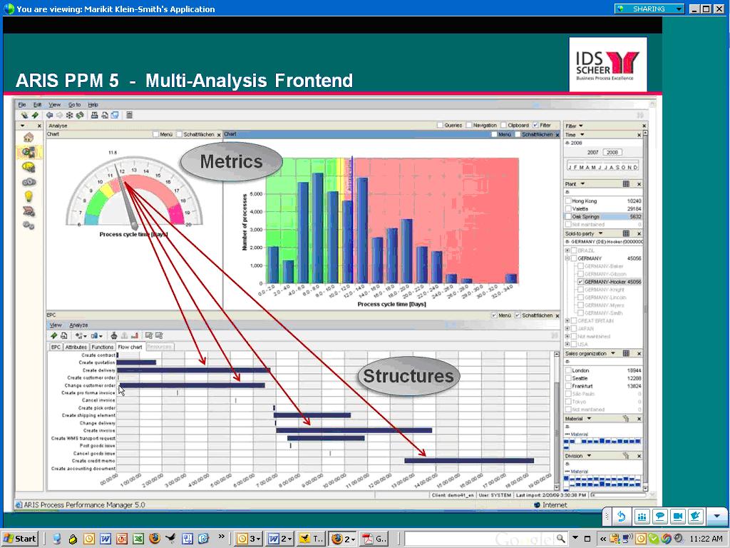
Figure 1. IDS Scheer’s ARIS Process Performance Manager lets users drill down from a performance metric in a dashboard to underlying process steps that caused the alert.
IDS Scheer partners with the big process management players (Oracle, SAP, Microsoft, and Tibco). For example, SAP resells ARIS PPM and Tibco OEMs it. While some partners offer process intelligence tools, Hess says its biggest competitors in this space are BI vendors. This is not because they offer process intelligence tools but because the IT department doesn’t want to purchase another “analytical” product unless it can eliminate other BI tools it already has through a standardization or consolidation program.
Selling into that kind of environment is challenging. Plus, mapping out business processes sounds like a nightmare and a potentially big inhibitor to doing deals. So I asked Hess to explain where his company has been most successful in selling ARIS PPM. He said the biggest market for the product is SAP customers who want to analyze “order-to-cash” and “procure-to-pay” processes within SAP’s sales and administration and procurement modules respectively. IDS Scheer offers a package for these two processes that come with predefined extraction routines for SAP content and analytical templates for displaying key process metrics. The packages reduce the complexity and time needed to map processes and deploy the tool.
“It takes five days to install and configure the packages” compared to 15 to 20 days for a custom implementation, says Hess. IDS Scheer also offers packages for human resources (“hire to retire” and recruitment), IT (incident management), accounting (billing), insurance (claims management) and banking (loans.) However, Hess was quick to point out that process mapping isn’t a time consuming nightmare. Evidently, ARIS PPM can automatically generate process workflows using sophisticated algorithms, which takes the pain out of mapping actual processes. I’ll have to see this to believe it!
Finally, Hess said that last year IDS Scheer augmented its nascent process intelligence portfolio by shipping a a product called ARIS Process Event Manager (PEM). Whereas ARIS PPM helps customers analyze and optimize processes, PEM monitors events so front-line workers can take action and close the loop. I’ve written about products like this in my research on operational BI. (Click here for a recent report.) Until recently, most companies needing such capabilities for fraud detection, stock market trading, or online recommendation engines have built it themselves. However, the off-the-shelf products from IDS Scheer, Altosoft, SeeWhy, and Coral8 (now Aleri) enable companies to save money and time when creating event-driven analytical applications.
Posted by Wayne Eckerson0 comments