Designing Dashboards
How do you deliver dashboards that end users will adopt and use? That was the gist of the insightful and humorous presentation titled “Dashboards to Die For” delivered by John Rome, Associate Vice President in the Technology Office at Arizona State University (ASU), at TDWI’s BI Executive Summit in San Diego earlier this month.
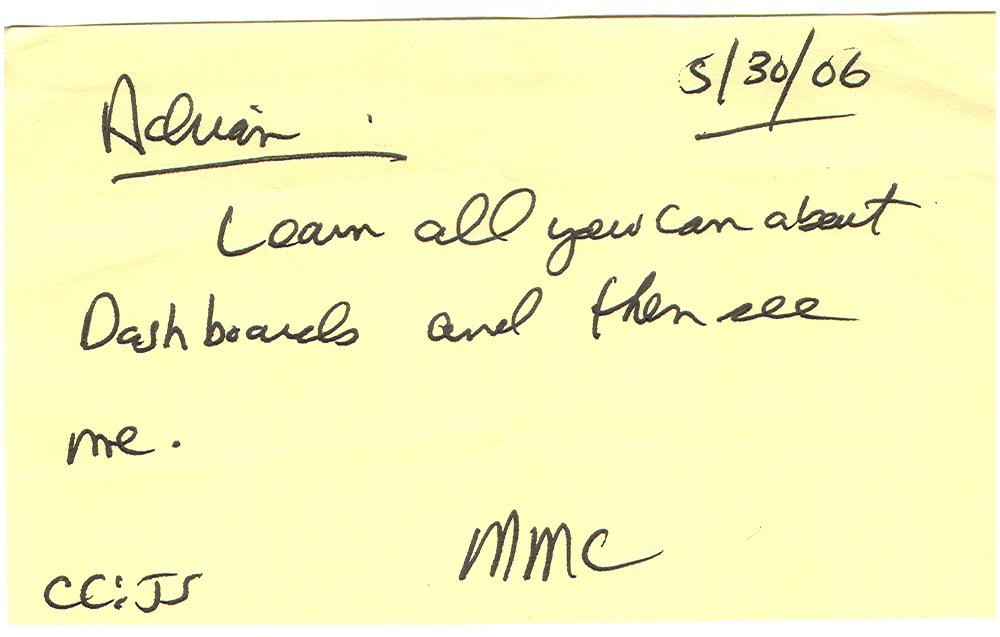
ASU’s dashboard project started with a memo from the University’s president to the CIO, Adrian Sannier, Rome’s boss, that said “Adrian, learn all you can about Dashboards and then see me.” (See figure 1.) With a data warehouse already in place, the dashboards would be instrumental in driving usage to higher levels, making BI pervasive, according to Rome.
Figure 1.
The data warehouse already contained most of the data so ASU only needed a flexible development tool and design principles to put the icing on the cake. It chose a dashboard tool from Corda Technologies which enabled it to create dashboards quickly by pulling data from any system, including the data warehouse. It then consulted a few dashboard and design experts, including Edward Tufte, Stephen Few, and yours truly.
Four years later, ASU has deployed dozens of dashboards in multiple departments and now has its own tips and techniques for delivering user-friendly and powerful dashboards. Here are a few of John’s recommendations:
<!--[if !supportLists]-->
- Embed dashboards as a link within the corporate portal so users have one click access to the information
- The best screen size for the dashboard window is 1024 x 768
- Place the most important elements for viewing in the upper left hand corner and the least important in the lower right corner to mimic the way the eye scans a page.
- Avoid decorative dashboard elements, like dials, gauges, and images and cluttering the screen with images and color.
- Design your dashboard pages to mimic popular Web layouts.
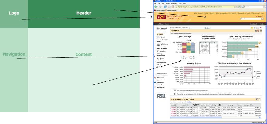
- Create a summary screen of the most important information. (See figure 2.)
Figure 2.
- Place elements on the screen so users don’t have to scroll.
- Add a “design tip” logo that users can click to get techniques about using the displayed elements and offer an online help center that provides a directory of topics for using the dashboards.
- Avoid pie charts, 3-D elements, and gradient shading.
- Accommodate color blindness.
- Accent key variables with subtle hues or patterns. See figure 3.
Figure 3. From
The Dashboard Spy. 
- My favorite: “Power comes with interaction/drills.”
- Make dashboards actionable. Here ASU has bidirectionally linked its dashboards to various operational systems, such as its PeopleSoft HR system, so authorized users can update the status of employees, classes, students, professors, etc.
- Use non-serif fonts and 12 point text for the main body and smaller fonts for supplementary text.
- Provide metadata about metrics, including SQL used. Offering screen cams and FAQs also helps.
- Use ranking to help users assess key elements within the data and to promote friendly competition among peer groups.
- Use charts rather than tables.
- Abbreviate numbers appropriately, so that $13,002,000 is $13M
- Perform usability studies to understand how users interact with the dashboard.
- Customize the dashboards by role.
Of all the design tips, the most powerful are to make the dashboards drillable, actionable, and instantly informative. ASU has put a lot of time and thought into the design and delivery of its dashboards and the effort has paid off. But don’t just take my word for it; check out ASU’s public dashboard Web site where you can get more information about the dashboards used at the University: http://dashboard.asu.edu.
Posted by Wayne Eckerson