
Data Stories: Marking One Million
As the death toll from COVID-19 rose over one million, news organizations tried to convey the scale in multiple ways.
- By Upside Staff
- October 7, 2020
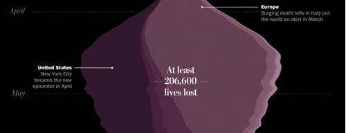
Scroll through this graphic from The Washington Post to review the COVID-19 pandemic so far. Below the big graphic are stories that chronicle the major global stages of the outbreak.
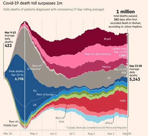
This simpler graphic from the Financial Times shows the one million dead by region.
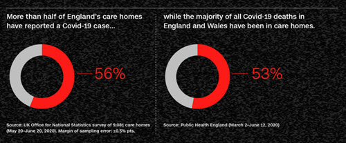
CNN’s coverage includes multiple charts and graphs that show snapshots of coronavirus impacts around the world.