
Data Stories: Working Remotely and Limiting Travel
These visualizations show how many people worked from home before the coronavirus pandemic and the effect the virus has had on city traffic.
- By Upside Staff
- April 1, 2020
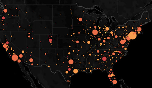
This interactive visualization from Overflow Data shows where in the U.S. people worked from home regularly before this year.
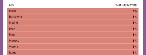
The City Mobility Index provided by urban travel app Citymapper is a fascinating snapshot of how little travel is going on in some places.
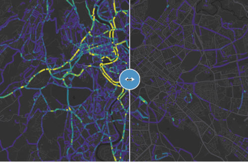
To show the effect of COVID-19 on individual cities, Buzzfeed collected these GIFs that effectively demonstrate the difference between normal traffic and recent traffic.
Editor's Note:
More COVID-19 news is available at our sister websites, FCW and GCN.