
Data Stories: Outbreaks and Spreading Information
The spread of the new coronavirus has inspired a lot of media coverage, which leads to a lot of data visualization.
- By Upside Staff
- February 12, 2020
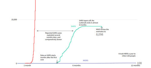
These charts from Reuters compare the new virus that emerged in Wuhan to previous coronavirus outbreaks.
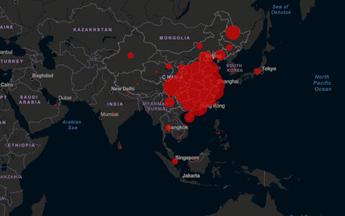
The Center for Systems Science and Engineering at John Hopkins University has created this interactive dashboard that tracks important statistics in real time.
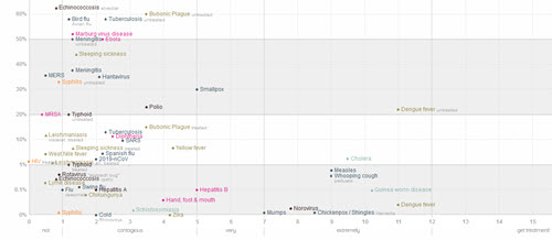
Meanwhile, Information is Beautiful has added the new virus (2019-nCoV) to an interactive chart comparing the deadliness and contagious nature of infectious diseases. Make sure to explore the story buttons below the chart for more information about how we understand disease.