Data Stories: Seasonal Data Visualization Examples
These visualizations explore horror movies, autumn leaves, and Halloween spending trends.
- By Upside Staff
- October 30, 2019
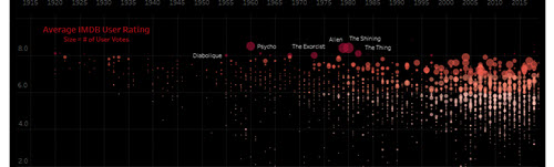
Are you looking for something spooky to watch? This Tableau workbook allows you to explore horror films by year and rating.
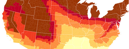
For a less frightening activity, consider leaf-peeping. We may be reaching the tail end of this year’s season, but this map shows when and where the trees were predicted to change color across the U.S.
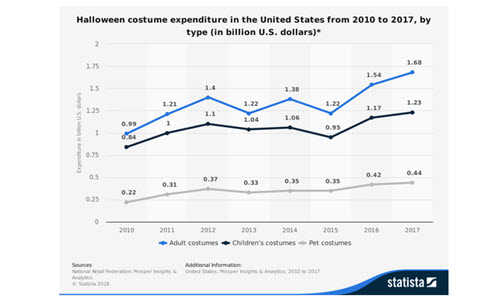
Northeastern University’s graduate school promoted their analytics program last year with this post about Halloween spending trends and what can be learned from them.