
Data Stories: Illustrating Utilities and Power Sources
These data visualizations show sources of electrical power, but each has a different focus and approaches the data in a different way.
- By Upside Staff
- July 24, 2019
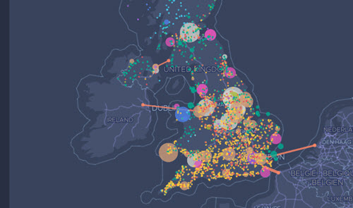
The United Kingdom has drastically changed its power supply over the last decade. The entire timeline of this change is illustrated in this article through an interactive map that animates as you scroll.
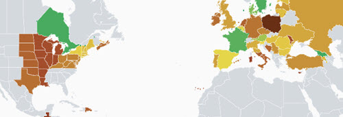
This open source climate impact map is trying to create a current snapshot of the greenhouse gas emissions created by electricity consumption around the world.
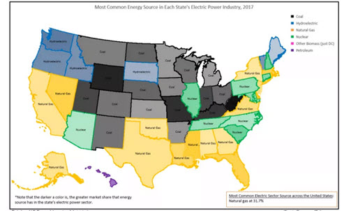
This article uses a variety of static charts and graphs to explain the various electricity sources across the U.S. and how they have changed over time.