
Data Stories: Create and Understand Data Visualizations
How to create more effective data visualizations, avoid illegible charts, and read a scatterplot.
- By Upside Staff
- December 12, 2018
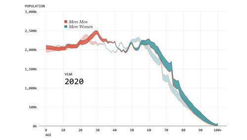
When creating a data visualization, you need to decide what question(s) you are trying to answer. This article from Flowing Data explains how to refine your visualizations by choosing the right focus.
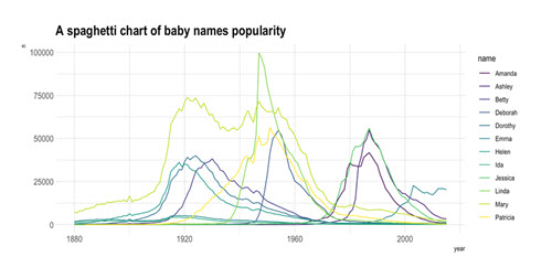
Displaying too many lines on one plot can make the resulting visualization impossible to read. This article demonstrates several techniques for clarifying this type of chart.
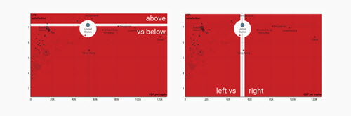
Scatterplots can encode a lot of information, but how quickly can you read them? The Datawrapper blog walks you through several quick ways to gain insight from a scatterplot.