
Data Stories: Exploring Science, Population, and Company Value over Time
Visualizations can demonstrate historical change. These charts show scientists whose ideas were before their time, human population growth, and the scope of historical companies.
- By Upside Staff
- July 25, 2018

Information is Beautiful provides this interactive chart about major figures in science whose ideas were initially rejected, but later proven right.
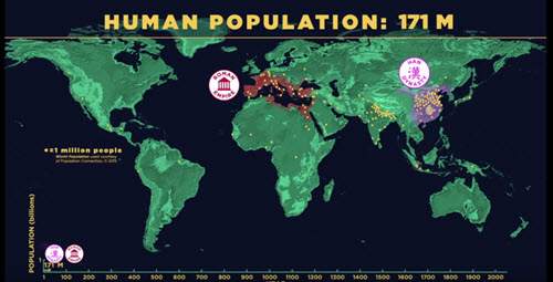
This animation from the American Museum of Natural History shows the migration and growth of human population through history.
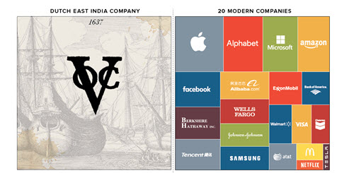
Would you believe that the most valuable company of all time isn’t a modern enterprise? This chart and article from Visual Capitalist explains the scope of historical speculative bubbles.