
Data Stories: Running Routes, Calorie Counts, Dangerous Exercise
Visualizations help us understand where people choose to run, how foods compare, and where exercise becomes unhealthy.
- By Lindsay Stares
- March 1, 2017
Popular Running Routes
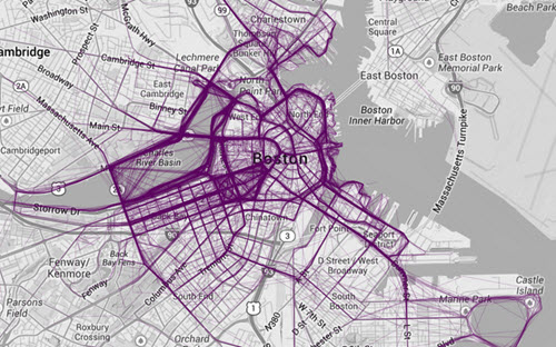
Many people now track or map their exercise with wearable fitness trackers or smartphones. Nathan Yau of Flowing Data mapped some publicly available running data and found some of the more popular routes.
Calories in a Colorful Chart
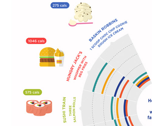
An Australian company that provides insurance quotes put together this playful infographic comparing the calorie counts of popular fast food items and how long one would spend on various exercises to burn an equivalent number of calories.
Where Exercise Isn’t Good for You
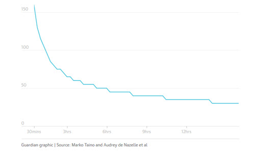
As part of a recent series on air pollution, The Guardian reported on a list of global cities where the dangerous effects of pollution offset the benefits of outdoor cycling after half an hour. The article includes a map, a chart showing the relationship between time spent exercising and danger from particulates, and a searchable table with more data.
About the Author
Lindsay Stares is a production editor at TDWI. You can contact her here.