
Data Stories: Guidelines and Examples
As Google releases its first set of design guidelines for data visualization, we look at some other tips and examples for effective data viz.
- By Upside Staff
- July 31, 2019

After more than a year of work, Google's dedicated Data Visualization team has published its first detailed guidelines for creating your own visualizations.
"Choose the right audience"; "choose the right chart"; and other important advice on creating effective visualizations from this 2018 blog post.
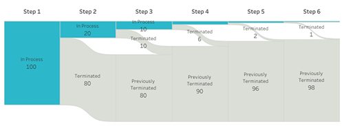
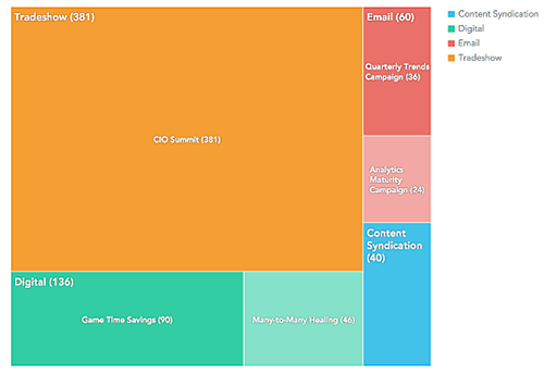
Courtesy of Tableau's public gallery, an array of possibilities for sales funnels, hiring pipelines, or other processes where candidates drop out along the way.