
Data Stories: Modeling Climate Change
Interact with these data visualizations to explore trends and projections about climate change.
- By Upside Staff
- April 8, 2020
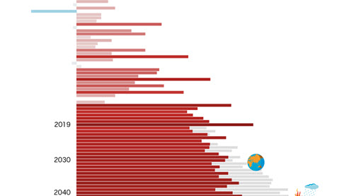
First, scroll through this piece of visual journalism from the Australian Broadcasting Corporation. You can click and drag the year at the top of the article to adjust the beginning to reflect your lifetime.
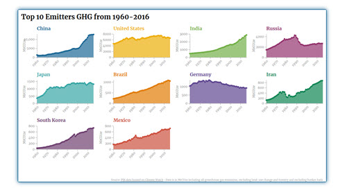
This blog post from data visualization professional Johannes Friedrich explains how to create seven impressive interactive charts about climate change.
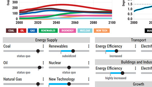
Have a handle on the topic? Play with this interactive simulator to visualize the impact of climate-related policies.