
Data Stories: Map Projections, City Streets, and Mapping Time
Visualization and analysis tools give us new ways of looking at how space is represented.
- By Upside Staff
- June 19, 2019

You know projections that map the spherical Earth to a flat surface distort the apparent size of countries, but do you know by how much? These animated maps show how much the classic Mercator projection shifts a viewer’s perception.
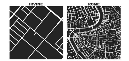
This article describes how a tool for analyzing street maps can be used to generate these one-square-mile pieces of cities. Note the patterns that are more easily compared when examined at a consistent scale.

Sometimes travel time is more important than physical distance. This blog post from Gradient Metrics experiments with methods for plotting Manhattan in time as well as space.