
Data Stories: Pizza, Beer, and Meat Alternatives
Explore circles with an interactive data toy and infographics about food.
- By Upside Staff
- August 24, 2022
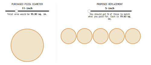
This interactive feature on Flowing Data uses pizzas to demonstrate how circle sizes can be deceptive.
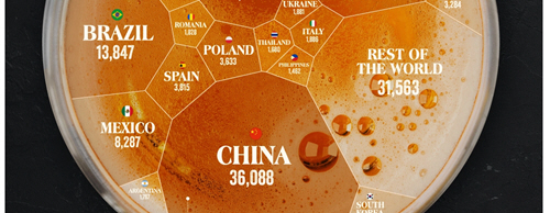
This infographic shows beer consumption around the world. The design is cute, but the style means that a viewer would have difficulty directly comparing just the shapes.
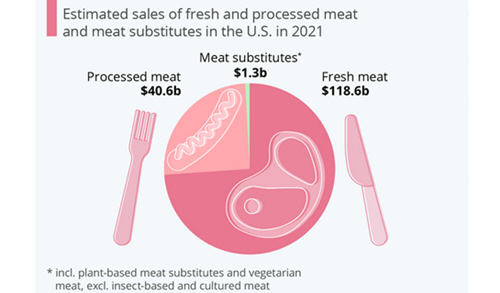
This small infographic clearly shows how small the market for meat substitutes currently is in the U.S.