
Data Stories: Designing Charts and Infographics about Climate Change
Why the charts in this year’s IPCC report are so effective and two additional data visualization examples.
- By Upside Staff
- October 6, 2021
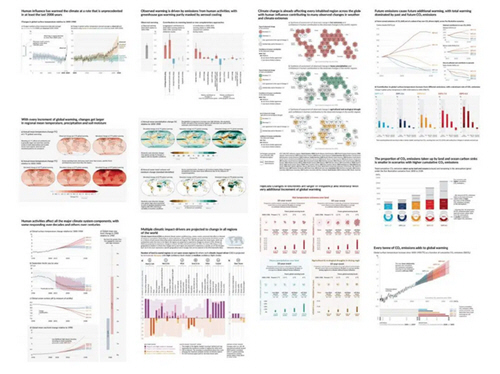
This article from the Bulletin of the Atomic Scientists sings the praises of the graphics and charts in this summer’s report from the Intergovernmental Panel on Climate Change (IPCC) and explains some of the process that went into these visuals.
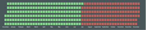
Maybe you have one statistic you need to focus on in a visualization. This streamlined graphic changes as you scroll to show how more natural resources are used each year.
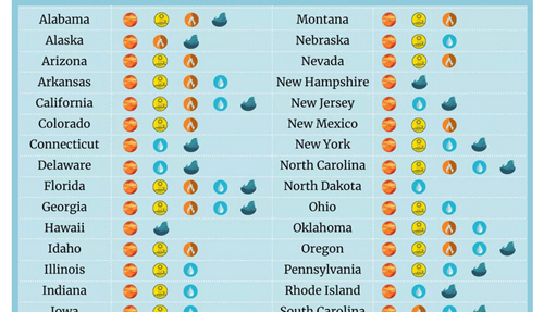
Communicating with data sometimes means choosing to break down information so that a viewer can understand the personal impact. An infographic in this CNET article shows which impacts of climate change are likely in which U.S. states.