Data Stories: Giants Online and Offline
Data visualizations can be especially helpful for understanding the very large and the very small. These graphics explore the giants of the web, titans of technology, and ancient empires.
- By Upside Staff
- April 24, 2019

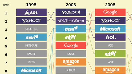
This infographic from Visual Capitalist shows how the biggest online properties have changed and grown over the last 20 years.

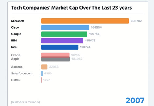
Websites alone don’t dominate the tech world. This animation shows the market capitalization of the top tech companies over time.

This artistic visualization compares the total land controlled by historic empires at their peaks with the size of the Earth. The small “moons” are the current-day areas that correspond to each empire. See a larger version here.