
Data Stories: Pros and Cons of Pie Charts
Pie charts can be misleading or confusing, but they can also be just right for the data.
- By Lindsay Stares
- October 4, 2017
When Not to Use Pie Charts
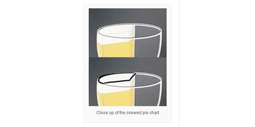
Three-dimensional pie charts are widely derided, and this data visualization blog shows why with a real-world example of a confusing chart.
Pie Chart Best Practices
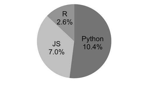
On the other hand, another blogger proposes that pie charts are fine when used correctly. This article explains some simple guidelines for creating accurate, easy-to-read charts and demonstrates some common mistakes.
When the Best Choice Is Pie
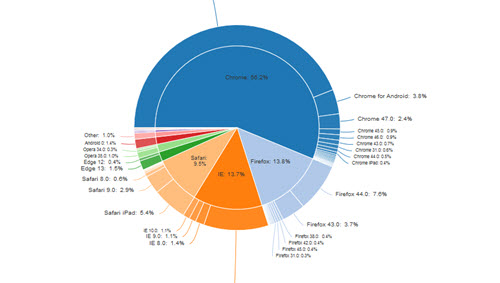
The Displayr blog takes this argument even further, claiming that pie charts are often superior to other types of visualizations. Whatever charts you choose, clarity should always be a primary goal.
About the Author
Lindsay Stares is a production editor at TDWI. You can contact her here.