
Data Stories: All About Home
See how data visualizations help us understand when people relocate, how they connect, and what they believe.
- By Lindsay Stares
- December 21, 2016
Going Home to a New Place?

Over a year’s time, almost 15 percent of Americans move to a different home. This interactive chart uses data from the American Community Survey to show those who moved last year versus those who stayed put. You can use the drop-down menus to filter by state, gender, race, and marital status.
Pick Up the Phone and Call Home
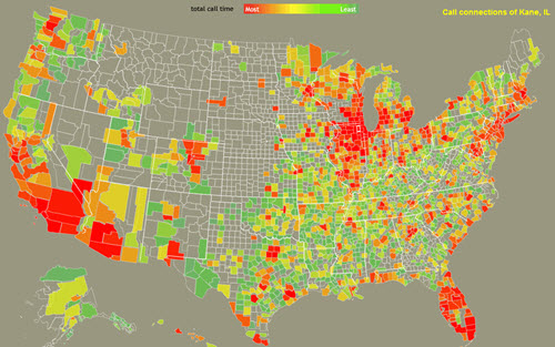
Have you called your friends and family recently or texted them? “The Connected States of America” was a 2011 project at MIT that explored how phone and text data could show social connections across the U.S. This interactive map allows you to choose a county (not all counties have data) and see how phone calls connect it to both nearby and far-flung regions.
American Religions by the Numbers
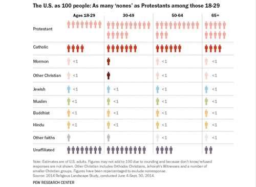
Pew Research put together this interesting series of graphics that simplify the huge numbers that make up U.S. religious demographics with a simple metaphor. If the country were made up of only 100 adults, what would that look like?
About the Author
Lindsay Stares is a production editor at TDWI. You can contact her here.