By using tdwi.org website you agree to our use of cookies as described in our cookie policy. Learn More

TDWI Upside - Where Data Means Business

Data Stories: The Current State of COVID-19

The speed of the Omicron variant tearing around the world has data visualization makers struggling to keep up.


Understanding the Data

sample of data visualization, linked to full visualization at NYTimes 

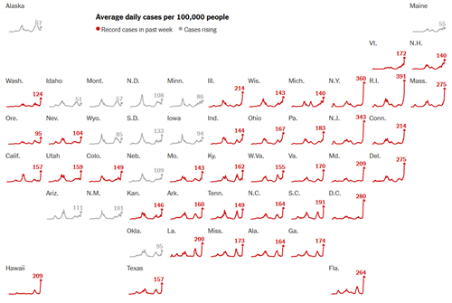
This recent piece from the New York Times walks you through how to understand charts and data for the Omicron variant.


Keeping Up with the News

sample of data visualization, linked to full visualization on Substack 

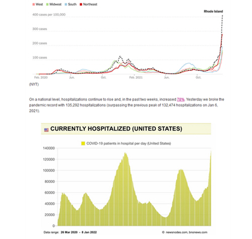
This free newsletter from epidemiologist Katelyn Jetelina collects charts, research, and news from around the world and helps contextualize the findings.


Availability of Care

sample of data visualization, linked to full visualization at GitHub 

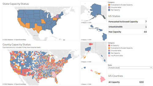
This interactive set of maps (currently in progress and still being improved) allows you to explore current hospital capacity across the U.S.

TDWI Membership

Accelerate Your Projects,
and Your Career

TDWI Members have access to exclusive research reports, publications, communities and training.

Individual, Student, and Team memberships available.