
Data Stories: Mapping Demographics, Economics, and Outcomes
What is the best way to present demographic data? These visualizations explore demographics and economic outcomes with interactive flair.
- By Upside Staff
- October 24, 2018
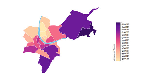
This series of charts explores the Swiss city of Basel. Maps show economic and demographic trends across districts, and interactive bar charts near the end of the article allow you to isolate segments or see overall numbers.
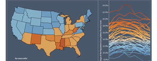
This interactive visualization focuses on poverty levels over time in the U.S. The combination of maps and charts allows the viewer to compare and explore multiple perspectives.
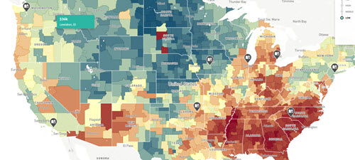
The Opportunity Atlas project attempts to determine which neighborhoods in America offer children the best chance to rise out of poverty. The filters allow you to narrow in on specific groups and ask complex questions. Click on the story highlights on the map to learn more.