
Data Stories: Rising Temperatures, Commuter Preferences, and Wildfire Damage
Discover temperature trends, public transit patterns, and where wildfire spread in these visualizations.
- By Lindsay Stares
- November 8, 2017
How Many Days Hotter than Normal?
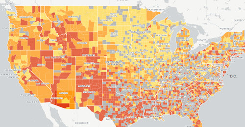
This interactive map from the National Resource Defense Council shows which counties in the U.S. have more annual days of extreme heat. Click on a state to drill down for more detail.
Do You Like to Sit or Stand?

DNAInfo asked their readers to participate in a simulation of Chicago’s public transit system and developed this series of heat maps showing where people’s favorite seats are. You can also read more about the project or take the quiz yourself.
A Different Kind of Heat Map
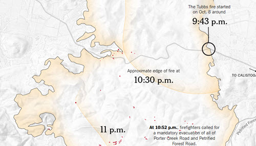
Analysis from The New York Times created this map of the recent California wildfire, showing the speed and extent of the damage.
About the Author
Lindsay Stares is a production editor at TDWI. You can contact her here.