
Data Stories: The Pros and Cons of Heatmaps
Although some would say heatmaps are inherently flawed, this visualization style can be effective if used correctly.
- By Lindsay Stares
- May 10, 2017
The Case Against Heatmaps
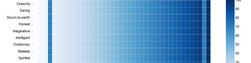
Heatmaps can be very pretty, but this post from the Displayr blog explains why users can have trouble interpreting them because of human visual limitations.
A Heatmap of Actual Heat

On the other hand, heatmaps and similar graphics can be effective for showing trends over time. One example is this large chart of global average temperature from Climate Central.
Ineffective Graphics for a Laugh
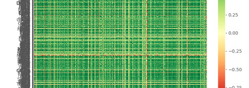
Of course, there’s also this approach, in which a completely illegible heatmap is presented simply because it “looks like a hipster’s overshirt.”
Effective Graphics Demonstrate Clear Conclusions
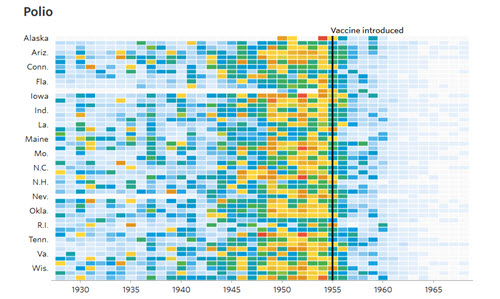
At the other extreme, heatmaps that are both useful and attractive appear in this Wall Street Journal feature from 2015. Each chart shows the number of cases of an infectious disease and the date that a vaccine was introduced. These charts are also interactive, in that you can hover over them for specific information.
About the Author
Lindsay Stares is a production editor at TDWI. You can contact her here.