
Data Stories: Disease and Danger Across Time and Place
Data visualization can help us understand how causes of death change over time and how demographic factors are correlated with gun violence.
- By Lindsay Stares
- May 3, 2017
Diseases Rise and Fall
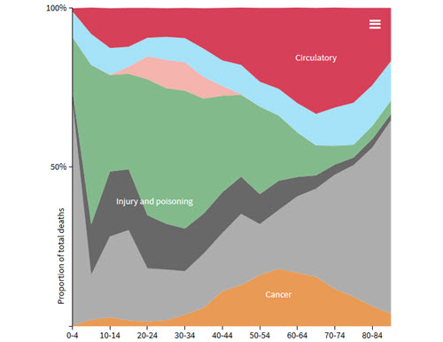
Determining change over time is one of the most straightforward uses of data visualization. This series of interactive charts from an Australian newspaper shows how different causes of death became more or less prevalent over the last century.
Accident or Overdose
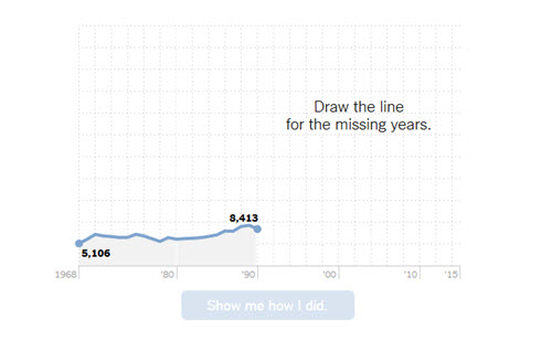
These interactive graphs from The New York Times also show deaths over time. The format invites you to guess the recent trend and then it reveals the truth, focusing on the recent rise in opioid overdoses.
Detailed Analysis May Help Stem Violence
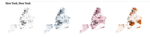
The Guardian analyzed the locations of gun homicides in the U.S. at a high granularity and created this series of maps. The color overlays show how social, economic, and educational disparities mark areas at high risk for violence.
About the Author
Lindsay Stares is a production editor at TDWI. You can contact her here.