
Data Stories: Slicing the Same Data Multiple Ways
Three ways to graph data from the American Time Use Survey: each shows a different way to think about the data set.
- By Lindsay Stares
- April 5, 2017
Time to Sleep and Time to Work
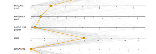
The American Time Use Survey is exactly what it sounds like -- thousands of people are asked how they spend their time. On Flowing Data, statistician Nathan Yau used this data to create an interactive chart showing the median amount of time spent on various activities by different demographic groups.
A Day in the Life
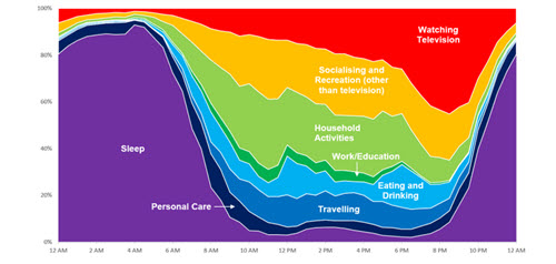
The very same data was used to create these charts that show average daily activities for Americans over 70. Rather than the number of hours spent over a day, this colorful exploration shows the percentage of people doing each activity at specific hours.
Office Hours
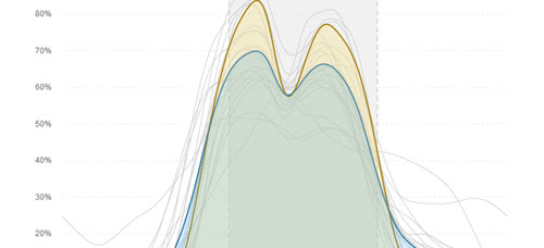
The same survey data (although from a previous year) was used once more on NPR’s Planet Money blog. This time, the interactive graphic singles out only the hours respondents report being at work and charts them by industry.
About the Author
Lindsay Stares is a production editor at TDWI. You can contact her here.