
Data Stories: Using Maps to Explore the Basketball Court, Global Health, and International Tax Evasion
Basketball shots, comparing mortality rates, and the Panama Papers are the highlights of data visualizations this week.
- By Lindsay Stares
- May 18, 2016
How Many Shots Did Kobe Bryant Make From the Left?
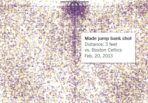
Over Kobe Bryant’s 20-year career with the Los Angeles Lakers, he attempted more than 30 thousand shots at the basket. To demonstrate just how many shots that is, the <em>Low Angeles Times</em> has provided this interactive graphic, mapping each one. It allows for impressively deep exploration into the data; you can even see just shots made in a single game!
How Many People Die of Cancer in Portugal vs. Spain?
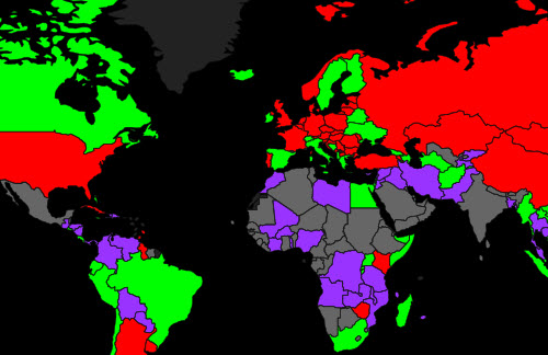
On a more somber subject, a website called World Life Expectancy has used global health data from multiple sources to map the rates of causes of death. You can select a cause from a drop-down menu, view trends across different regions, and hover the mouse over countries to see a specific statistic. This map is a good example of using a visualization to make publicly available data easier for the average viewer to understand.
How Many Companies Actually Based in Panama Were Hiding Money Offshore?
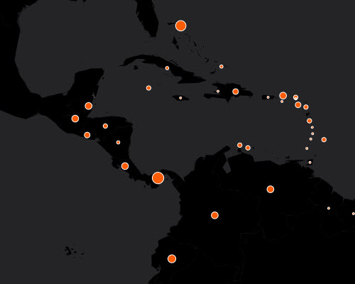
The Irish Times used an interactive map alongside other charts and lists to help their readers make sense of the scope of the Panama Papers. The map shows how many companies, shareholders, and clients based in various countries are named in the leaked material.
About the Author
Lindsay Stares is a production editor at TDWI. You can contact her here.