
A Framework for Putting Analytics into Action
A five-step framework helps you design reports and visualizations that use data to transform your business.
- By Stan Pugsley
- April 19, 2021
When designing reports and visualizations, think of them as part of a navigation framework that lead your end users to take action. More than just telling stories, you want to use data to transform your business.
Analytics without action doesn't improve your bottom line. That's why it's important that you design and integrate your reports and visualizations as part of a data-to-action strategy. This strategy goes beyond supplying a useful insight or piece of information. It is an action path that will guide users through your analysis and eventually take steps that can improve the business. To help you build effective visualizations that achieve this goal, we developed a five-step framework.
Let's use map navigation apps, such as Google Maps or Apple Maps, as a metaphor for the steps of this framework.
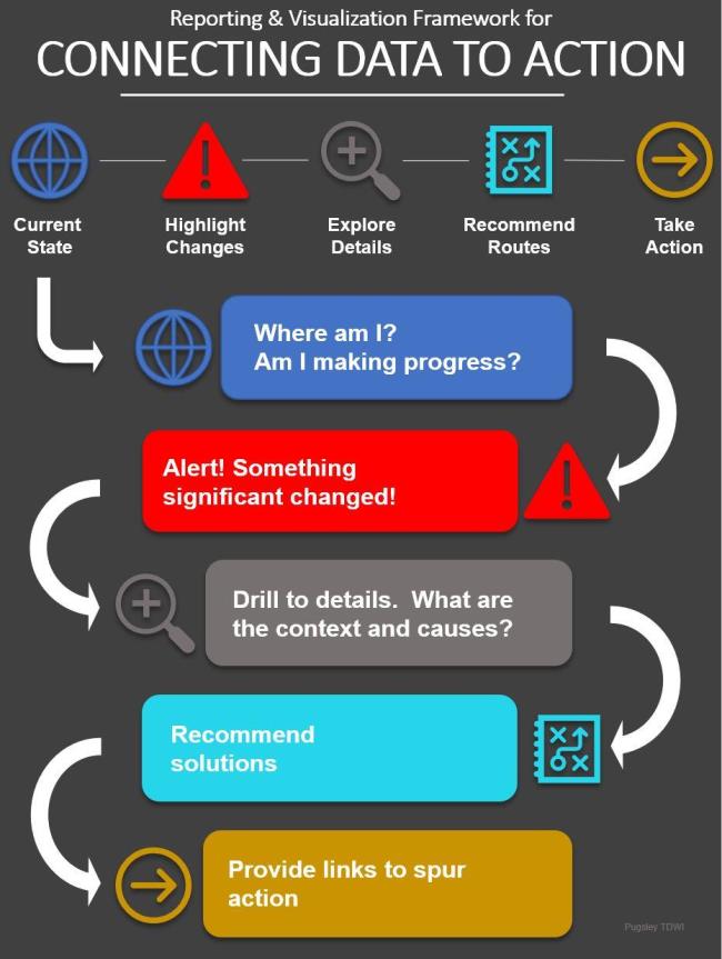
Current State
Whether you're beginning a new journey or continuing on with an existing one, you'll access your map app, and ask these questions:
- Where am I on the map now and where do I want to be?
- How far do I have to go?
These are the same questions we would want to answer to our Current State set of KPIs. These are the lead visualizations that you place on your executives' dashboards to help them answer the "where are we now and how far is it until we reach our goal" questions.
Highlight Changes
When we consult the map, our next priority would be to look for significant signals, changes, or events that might impede our travel. For example:
- Are conditions constant or do we expect changes to travel conditions (e.g., construction slowdowns or rush-hour traffic congestion) ahead?
- Is traffic flowing at the expected speed?
- Is traffic returning to normal speed?
Likewise, we should use bright colors and attention-grabbing icons in reports to highlight changes in the data. Alerts should be placed on any significant change, whether positive or negative, using a 95 percent confidence limit as the test. Assume that your audience doesn't have the time or context to discern whether the current state is better or worse than before. Make the changes stand out and command attention.
Explore Details
Every lead KPI and alert needs to be paired with one or more drill-down paths so we can examine specifics of current or forecasted conditions. We want to explore details. These are supplemental visualizations. In a map, these would answer questions such as:
- How many roadblocks or obstacles are in my route? What's the reason (a traffic accident, for example)?
- Is the whole route slow or just my lane?
- What is causing the slowdown?
The path to these drill downs needs to be simple and clearly labeled or marked. In reports and visualizations, exploring details should be simple and easy to access. Ideally, each department or business process would have its own drill down module or folder.
Recommend Routes
The next step is the one that is most often missed. Drivers want to know about alternate routes. Likewise, users want more than the opportunity to explore their issues. They don't want a data dump; that's overload. Users (and drivers) want to know how to resolve issues; they are looking for recommendations. Drivers want to know:
- What are my alternate routes?
- What is the cost and ETA for each route?
- Is there a recommended best route?
In the case of your reports and visualizations, not every change in every chart will have an automatic recommended best route, but many do. If inventory is low for a particular item and one or more options to correct the situation available, why not note them right on the report? If costs are increasing faster than planned in one department, how can the user address the issue? List those suggested procedures (solutions) right where the information is needed and useful -- as the information is consumed.
Take Action
Once a driver chooses a solution, a map application can go the extra mile and make it easier for the driver to put that solution into action by answering such questions as:
- Where should I turn next?
- How much further until I should take another action?
- What is my new ETA?
In your visualizations, tie your reporting to next actions by embedding links to the associated applications right in the reports. If inventory is low, add a link below the KPI to the warehouse management software. If sales are dropping in one region, add a link to sales management or your CRM system for easy follow up.
Information into Action
If you expect map navigation apps to go beyond giving you current conditions, why not expect the same from our business navigation tools? Turn your reporting tools into navigation tools by using the five steps in this framework.
About the Author
Stan Pugsley is an independent data warehouse and analytics consultant based in Salt Lake City, UT. He is also an Assistant Professor of Information Systems at the University of Utah Eccles School of Business. You can reach the author via email.