Data Stories: Staying Abreast of COVID-19
As the coronavirus pandemic continues across the globe, many organizations are providing ongoing or updated visualizations and analysis.
- By Upside Staff
- August 26, 2020

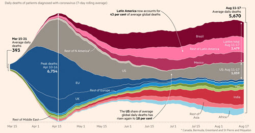
The Financial Times is continuously updating the visualizations and information in this article to keep you up to date.

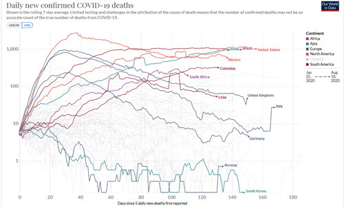
If you’d rather explore the data yourself, the coronavirus coverage on Our World in Data features complex interactive charts and reports as well as in-depth research and analysis.

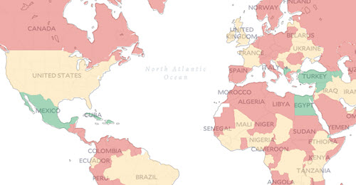
This interactive map allows you to enter where you’ve been and see what countries would allow (or not allow) you entry because of COVID-19.