
Data Stories: Having Kids, Paying for Care, Education Rates
These data visualizations show patterns for childbirth, daycare costs, and high school education in the U.S.
- By Upside Staff
- April 17, 2019
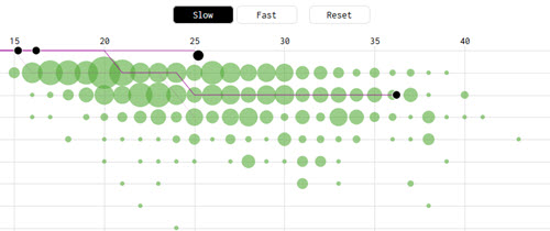
This animated chart from Flowing Data uses data from the National Survey of Family Growth to simulate the lives of one thousand American mothers, showing how many kids each had and when. As the animation progresses, patterns become clear.
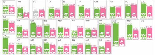
Once you have a child, there are expenses. This infographic shows where in the U.S. daycare is more expensive than state college.
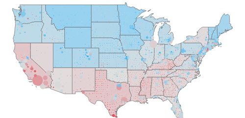
To go to college, you have to finish high school first. This interactive chart shows the percent of the population without a high school diploma.