
Data Stories: Data Visualizations Good Enough to Eat
Learn about global flavors, ingredient popularity over time, and how fruits and vegetables are classified in these interactive visualizations.
- By Upside Staff
- February 20, 2019
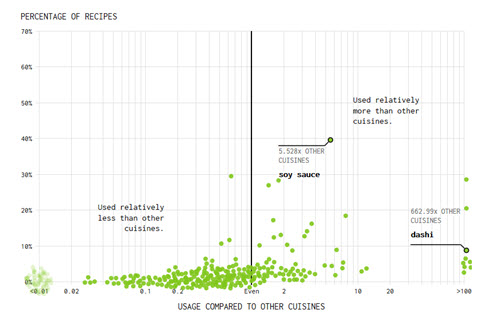
What makes a culture’s food taste unique? Flowing Data uses tables and interactive charts to explore statistically uncommon ingredients using a data set of recipes.
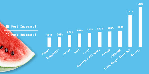
This series of colorful charts highlights how Americans’ tastes have changed over time by showing how specific ingredients rise and fall in popularity.
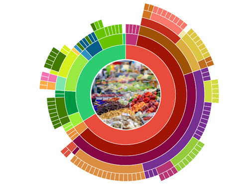
Hover over this fun interactive graphic to explore the culinary classifications of edible plants.