
Data Stories: How Color Helps and Hurts Data Visualization
Why you should avoid rainbow color schemes, alternatives to consider, and best practices for color use.
- By Upside Staff
- September 19, 2018
You might know that using many colors isn’t a best practice for visualization, but do you know why? This article from EagerEyes demonstrates how a rainbow color scheme can be deceptive along multiple axes.
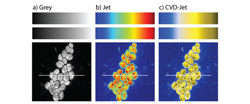
What should you use instead of a rainbow color scheme? Scientific American reports on a new color scheme designed to be optimal for interpretation by all viewers.
Avoid misleading viewers by making thoughtful choices with color. This article on the Chartable blog explains some fundamental guidelines.