
Data Stories: Create Better Tables, Violin Plots, and Infographics
Learn to create clearer tables, when and how to use violin plots, and why infographics might improve BI adoption.
- By Lindsay Stares
- December 7, 2016
Creating Better Tables
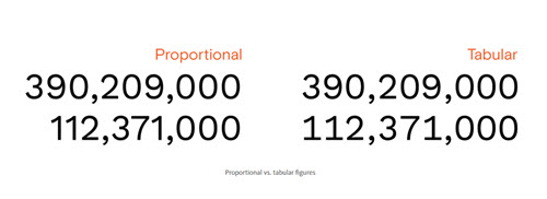
The humble table doesn’t seem like much compared to modern data visualization, but tables are still a fundamental method for presenting data. This Medium post provides simple guidelines you can use to ensure your tables are easily understood.
The Anatomy of a Violin Plot
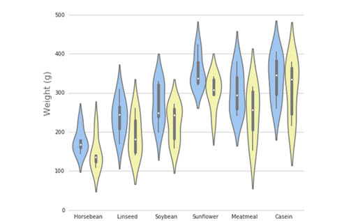
Need something more complex than a table? More complex than a distribution plot? A violin plot is a good solution for demonstrating peaks and valleys in the distribution of values. Learn when to use a violin plot and how to create one in this blog post from Mode Analytics.
Infographics Improve BI

BI software provider Yellowfin is incorporating more support for visualizations and infographics into their product. Communications manager Lachlan James explains on the company blog why Yellowfin believes good infographics can improve BI adoption and facilitate sharing information within an enterprise.
About the Author
Lindsay Stares is a production editor at TDWI. You can contact her here.