
Data Stories: Delicious Visualizations About Food
These visualizations explore the cost of cooking, the popularity of cereal brands, and the health benefits of “superfoods.”
- By Lindsay Stares
- October 19, 2016
The Price of Going Out to Eat
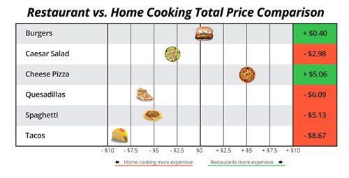
If you’re trying to save money, one common tactic is to eat at home rather than going out. Is it really cheaper? One team at Datafiniti tried to find out. Read about their methodology and see some comparison charts for different types of food.
Real-Time Cereal Popularity
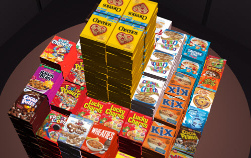
Web content and analytics provider Permanent Record must have had some fun creating this project. It graphs Twitter mentions of breakfast cereal in real time with a 3D animation!
The Relative Evidence for Health Food Claims
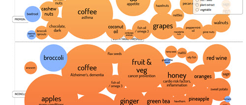
You’ve probably read endless studies that this food or that drink prevents cancer or cures the common cold. The research team at Information is Beautiful compiled a huge number of different studies on such claims, then plotted the results into a huge interactive chart. The strength of the evidence shrinks as you scroll down, and each bubble can be clicked for more information.
About the Author
Lindsay Stares is a production editor at TDWI. You can contact her here.