
Data Stories: Visualizing Climate Change
Data visualization is ideal for a complex subject such as climate change. These pieces are strong examples of how charts and animations can portray large numbers and trends.
- By Lindsay Stares
- October 5, 2016
Factors in Current Climate Trends
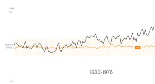
This animated presentation from Bloomberg presents findings from NASA’s Goddard Institute for Space Studies. As you scroll down, different charts appear showing a variety of factors that affect global temperatures and how projections based on combinations of these factors compare to observed annual temperatures.
How Warm Was This Summer?
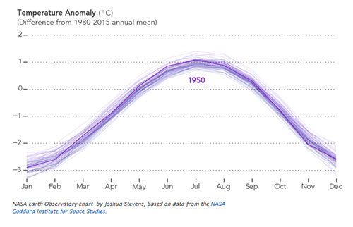
Here’s more recent NASA data, charting monthly global averages from 1880-2016, presented as an animated gif.
Warming on a Geologic Scale
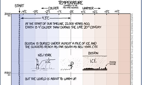
Randall Munroe, creator of the webcomic xkcd, often takes advantage of the flexibility of the Internet to create interesting and artistic comics, animations, and charts. This recent project is mildly tongue-in-cheek at times; it charts global temperature from 20,000 BC (the Ice Age) to the present.
About the Author
Lindsay Stares is a production editor at TDWI. You can contact her here.