
Data Stories: Look, Visualizations in the Sky!
Data visualizations can show us places and things we can’t experience personally. These websites allow you to explore satellites passing overhead, known exoplanets, and nearby stars.
- By Lindsay Stares
- September 14, 2016
Satellites Orbiting the Earth
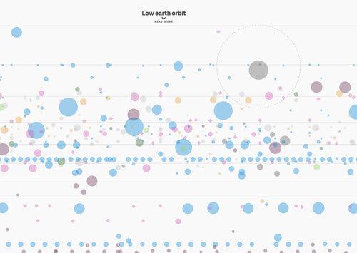
Digital news website Quartz periodically updates this huge chart marking every active satellite. Each one is a circle with the size representing its weight. Color initially represents the country that launched it, but you have options to color them differently via a drop-down menu. Hover over any one for details. Make sure you scroll all the way down to see high orbit!
The Goldilocks Zone

This chart from National Geographic displays the relative size and temperature of a large number of planets. Green planets are in the “goldilocks zone,” the band of space around a star that is neither too cold nor too hot. An additional box marks the few that are close to Earth’s size and atmospheric pressure, therefore making them possibly suitable for human life.
It’s Full of Stars
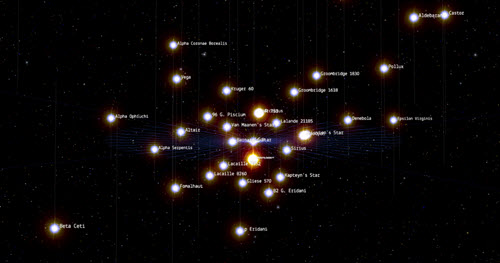
Google’s 100,000 Stars experiment plots the nearest stars to the sun in a virtual three-dimensional space for anyone to explore. Use the slider on the right to zoom in toward the sun or out to the stellar neighborhood. Toggle the music on the upper right, and view a tour on the upper left. Stars that have been named and studied have labels that you can click for more information. Clicking on a star label will also center your view on that star.
About the Author
Lindsay Stares is a production editor at TDWI. You can contact her here.