Data Stories: Life on American Streets and Highways
Are you going on a summer road trip or just driving to work today? These maps use huge data sets to show commuting distance and direction, the perceived safety of city streets, and the density of traffic fatalities.
- By Lindsay Stares
- August 10, 2016
See Where Commuting Takes Us
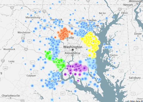
This interactive visualization uses data from the American Community Survey to show where commuters travel on a daily basis. Select a state and county from the drop-down menus to begin the animation. Each colored dot represents a group of commuters moving from where they live to where they work.
You can pause the motion to investigate the dots for more detail or adjust a pop-up slider to show a different range of travel distance. Under the county drop-down menu, you can also toggle between “workplace” and “residence” -- first look at the travel path for people who work in a particular county and then see how it’s different for those who live there.
Read the author’s blog post for more on the data and the tools used to create these maps.
Machine Learning Explores Our Perception of Safety
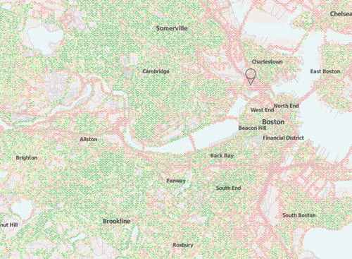
A research team at MIT Media Lab created a project called StreetScore, which taught a program to identify the apparent visual safety of a street from a photo. Once the algorithm had been trained with data from humans, it created these maps of perceived safety across entire cities. The researchers acknowledge the current flaws and limitations in their process, but they hope to use the algorithm to explore new avenues in urban science.
You can participate in the next project by providing feedback on images across a range of perceived qualities. This crowdsourced data will be used to further improve the machine learning algorithm.
Where Are the Most Traffic Accidents?
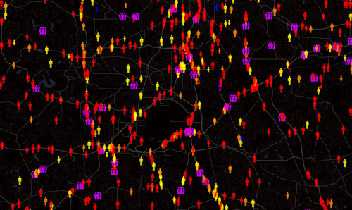
A project on Metrocosm plots a decade’s worth of data from fatal traffic crashes across the United States. The blog post explains the methodology and some notable statistics. On the interactive map, you can zoom in to any point or find a specific address in the search bar. The figures are color-coded for driver, passenger, or pedestrian, and you can turn on circles that highlight crashes caused by alcohol, speeding, or driver distraction.
About the Author
Lindsay Stares is a production editor at TDWI. You can contact her here.