
Data Stories: Life Moments and Gerrymandering
A timeline of human life, plus ending gerrymandering with algorithms.
- By Lindsay Stares
- April 27, 2016
View a Colorful Timeline of Human Life
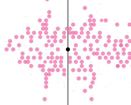
Information is Beautiful presents an interactive chart called “Who Old Are You?” Enter your date of birth and see where you are today among notable life moments, including everything from the age Martha Stewart started designing homes, to the age Michelangelo completed the David, to the average age at which someone wins a Nobel Peace Prize.
Oddly-Shaped Political Districts
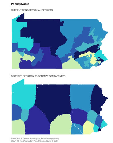
In this article, the Washington Post uses a chart to explain gerrymandering, then shows examples of what congressional districts might look like if drawn by an algorithm instead of a person.
About the Author
Lindsay Stares is a production editor at TDWI. You can contact her here.