Performance Management Strategies: Understanding KPIs
By Wayne W. Eckerson
KPI Components
Metrics versus KPIs. The term metric refers to measurements of business activity. But in a performance management system, we want to do more than just measure business activity; we want to measure performance aligned with business strategy.
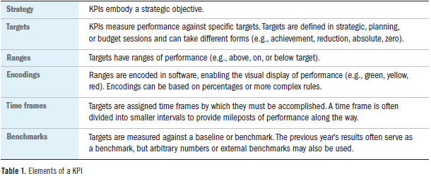
To distinguish between run-of-the-mill metrics and strategically aligned metrics, cognoscenti use the term key performance indicator, or KPI. The only difference between a metric and a KPI is that a KPI embodies a strategic objective and measures performance against a goal. The goals attached to a KPI are multidimensional: they have ranges that are encoded in software, a time frame by which the goals must be achieved, and a benchmark against which the goals are compared. (See Table 1.)
Goals and Targets. The goals associated with KPIs are known as targets because they specify a measurable outcome rather than a conceptual destination. Ideally, executives, managers, and workers collectively set targets during strategic, planning, or budget discussions. Such collaboration ensures buy-in and more accurate targets. Targets can also be set by a KPI team charged with translating strategic objectives into a performance plan.
Since KPIs derive much of their impact from the targets associated with them, it’s important to differentiate between types of targets. Ranga Bodla, senior director of enterprise performance software at SAP, defines five types of targets:
- Achievement: Performance should reach or exceed the target. Anything over the target is valuable but not required. Examples include revenues and satisfaction.
- Reduction: Performance should reach or be lower than the target. Anything less than the target is valuable but not required. Examples include overtime and attrition.
- Absolute: Performance should equal the target. Anything above or below is not good. Examples include in-stock percentage and on-time delivery.
- Min/max: Performance should be within a range of values. Anything above or below the range is not good. Example: mean time between repairs.
- Zero: Performance should equal zero, which is the minimum value possible. Examples include employee injuries and product defects.
Ranges. To help workers gauge their performance, most organizations stratify targets; that is, they divide the target into ranges, usually percentage increments above and below the target. (Think of the concentric circles around a bull’s-eye in an archery target.) Organizations can create any number of ranges around a target, although most use three: above target, on target, or below target.
Encodings and Thresholds. The next step is to encode ranges into graphical displays on a performance dashboard or report. It’s important that organizations apply a consistent encoding or scoring system to their KPIs no matter what type of targets they use. That way, when users look at a KPI display within a dashboard, all the conditional formatting (i.e., color coding) will connote the same performance values, according to Bodla. For instance, above target, on target, or below target ranges easily translate into red, yellow, and green color encodings.
The boundary line between ranges is called a threshold. When performance exceeds a threshold, the graphical representation of the KPI changes, say from yellow to green. Threshold-based encodings make it easy for users to assess the status of key business processes or projects at a glance, which is the major reason performance dashboards are so popular.
Although the use of three ranges is common, I once saw an operations group use 16 ranges and encoding schemes. Some organizations use multiple ranges to emphasize “stretch” or visionary goals that motivate employees to achieve above the norm and think outside the box. Others want to track granular gradations in performance, especially when they’ve attached monetary incentives to achievement levels.
Not all organizations encode target ranges using color; some use a variety of graphical devices, such as bullet graphs or other icons. For example, a beer manufacturer might use graphics of beer mugs that are empty, half-full, or full to portray performance against goals. The number of target ranges and choice of graphics depends on a group’s culture and preferences.
Encoding Nuances. Encoding performance is not always straightforward. Many organizations display only a handful of KPIs in an executive scorecard. As a result, those KPIs may be averages or aggregates based on multiple lower-level KPIs. The problem with averages and aggregates is that they may show above-target performance even when one or more of the lower-level metrics registers abysmal performance scores.
To avoid such dilution, architects apply Boolean rules to the thresholds and encodings. For instance, they might write a rule that says if one business unit scores in the bottom range, then mark the overall score as below average even if the rest of the associated KPIs are above average. Or architects may assign double or triple weights to the scores in the bottom range so they have a greater impact on the higher-level KPIs.
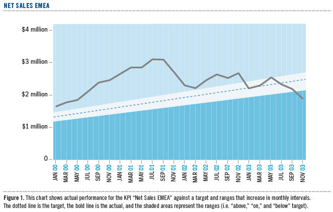
Time Frames. Performance targets have time frames, which affects how KPIs are calculated and displayed. Many organizations establish annual targets for key processes and initiatives. To keep employees on track to achieve those long-term targets, many organizations divide time frames into intervals that are measured on a more frequent basis. For instance, a group may divide the annual target to improve customer satisfaction from 60% to 64% into four quarterly intervals with 1% targeted improvement each quarter. In some cases, such as a retail environment affected by seasonal shopping, groups may back weight the targets toward the end of the year, since most sales occur during the December holiday season. (See Figure 1.)
Benchmarks. Finally, KPI targets are measured against a benchmark that becomes the starting point for improving performance. Typically, the benchmark is last year’s output. So, for example, a sales team may need to increase sales by 15% compared to last year. Or the benchmark could be an external standard, such as the performance level of an industry leader. Here, a company might want to set a goal of closing the gap in market share with its closest rival by 50% next year.
In some cases, the benchmark may be completely arbitrary. This often occurs with visionary goals, where an executive mandates a seemingly impossible goal to achieve. Like John F. Kennedy’s famous imperative to send a man to the moon by the end of a decade, visionary goals force employees to think outside existing norms and processes to achieve the desired outcome.
Reading KPIs
Reading KPIs should be straightforward. Users should be able to look at a visual display that has been properly encoded and know instantly whether a process or project is on track. But we find that many employees don’t know how to read KPI displays—or more alarming—how to interpret KPIs. (The latter involves a degree of analytical literacy that we’ll address later.)
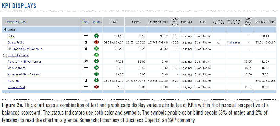
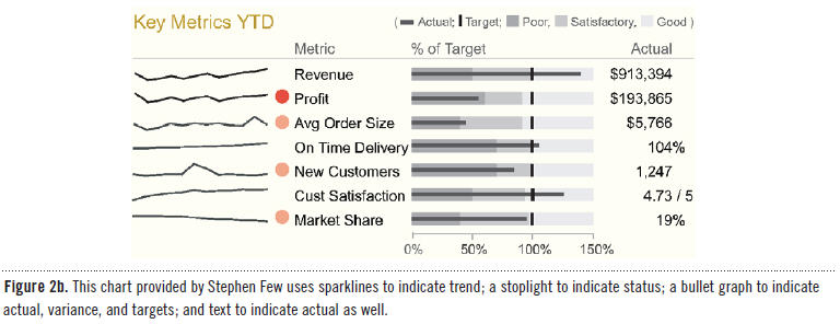
Seven Attributes. To assist users with interpreting KPIs, a good performance dashboard displays seven attributes for each (see Figures 2a and 2b):
- Status
- Trend
- KPI name
- Actual value
- Target value
- Variance
- Variance percentage
Status measures performance against the target and is usually shown with a stoplight. Trend measures performance against the prior interval or another time period and is often displayed using arrows or trend lines. The KPI name is usually hyperlinked so users can click on it to view a time series chart. The actual and target values are self-explanatory and usually displayed with text. Variance measures the gap between actual and target and is displayed using text or a micro bar chart or bullet chart. Variance percentage divides the variance against the target. These seven attributes combine to provide valuable insight into the state of performance.
Status is the attribute most people respond to first, since it’s usually displayed as a stoplight or gauge. A red stoplight on a dashboard jumps out at the viewer, who feels impelled to take notice. From there, users will examine variance and variance percentage to help them understand with precision just how bad (or good) the situation is. They then look at the trend, which signifies whether the situation is new or old, improving or declining. In essence, status signals a problem, variance describes its extent, and trend defines its movement.
But collectively, these attributes can give mixed signals. For example, if a KPI’s status is red but its trend is positive, what should a user think? Perhaps someone already spotted the problem and applied a remedy that is now working. Conversely, what if a KPI’s status is green but its trend is downward? A green light indicates that performance is above average, but shouldn’t the user take action now before the green light turns yellow?
Interpreting KPI attributes gets even more complex when the targets change each period or interval. For instance, if a KPI’s status is green and its trend is positive, but its variance is increasing, should the user be alarmed? This combination of signals indicates that performance is improving, but not fast enough to meet accelerated interim targets. In this case, many companies plot percentage variance, not actual values, to highlight whether the gap between actual and target is growing or shrinking over time. This takes some of the guesswork out of interpreting KPIs, which is especially helpful for new employees or managers who’ve been assigned to a new area.
Types of KPIs
Outcome versus Driver KPIs. There are two fundamental types of KPIs: outcomes and drivers. Outcome KPIs—sometimes known as lagging indicators—measure the output of past activity. They are often financial in nature, but not always. Examples include revenues, margins, return on equity, customer satisfaction, and employee retention.
On the other hand, driver KPIs—sometimes known as leading indicators or value drivers—measure activities that have a significant impact on outcome KPIs. These KPIs measure activity in its current state (number of sales meetings today) or a future state (number of sales meetings scheduled for the next two weeks). The latter is more powerful, since it gives individuals and their managers more time to adjust behavior to influence a desired outcome.
There is confusion about the difference between these two types of KPIs. (Some industry experts add performance indicators, key risk indicators [KRIs], diagnostic indicators, and other types of KPIs, which clouds the issue.) Truth be told, there often isn’t a lot of difference. “One man’s outcome measure is another man’s value driver,” says Neal Williams, founder of Corda and currently head of its professional services. “An outcome KPI in one dashboard could be a driver KPI in another.”
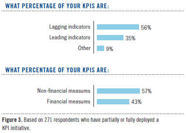
Creating KPIs. Most organizations find it easy to create outcome KPIs because they measure the desired state of a strategic objective. In fact, most companies already track outcome KPIs in management reports or dashboards, although most are slanted to financial objectives. Not surprisingly, the TDWI research majority of KPIs (56%) are outcome or lagging indicators, although a majority (57%) are non-financial measures, according to our research. (See Figure 3.)
On the other hand, many organizations struggle to define accurate drivers of future performance. It often takes months or years of trial and error to find metrics that correlate with future outcomes. A place to start is a brainstorming session in which a group identifies desired outcomes and then asks, “What behaviors or activities will drive or lead to that outcome?” Each time the group identifies a new driver, it should ask the same question: “What behaviors or activities will produce that result?” After several iterations, the group will find one or two root causes that have the most significant impact on the desired outcome.
Organizations can also conduct a statistical analysis to correlate outcomes with driver KPIs. For example, one online service provider identified two KPIs that correlate with the ability of telemarketers to meet daily sales quotas: the amount of time they spend on the phone with customers and the number of clients they speak with each day. The company also created a third KPI based on the previous two that projects every 15 minutes whether the telemarketers are on track to meet their daily quotas. This value driver, which is based on a simple statistical regression algorithm, enables sales managers to identify which telemarketers to assist during the next hour or so.
Operational Metrics. At TDWI’s BI Executive Summits, we’ve had lively debates about what organizations should measure and what they should not. Some people get zealous about the notion that organizations shouldn’t measure anything that isn’t directly related to a strategic objective. There’s a lot of validity to this argument, especially since most organizations are awash in metrics that don’t add much value to the business and consume needless time, energy, and money to manage and display.
However, there are plenty of operational metrics that may not directly roll up to a KPI in an executive scorecard, but are still important to measure. Michael Masciandaro, director of business intelligence at Rohm and Haas Company, says, “There are plenty of operational processes that may not be strategic, but if they break, you probably want to know about it, and sooner rather than later!”
For example, Masciandaro says mean time between repairs is a critical plant metric that drives maintenance costs but “will never show up on an executive dashboard.” He adds, “Manufacturing has hundreds of these measures.” Of course, scorecard advocates could argue that mean time between repairs is a key driver of cost and profit KPIs that do exist on the executive dashboard. They would argue that all operational metrics should drive higher-level KPIs, or it isn’t worth the time and energy to track them.
Qualitative and Quantitative KPIs. Another distinction between KPIs is that some are based on quantitative data, while others are based on qualitative or subjective data. Quantitative data measures activity by counting, adding, or averaging numbers. Operational systems that manage inventory, supply chain, purchasing, orders, accounting, and so on all gather quantitative data used by KPIs. Financial KPIs are based on quantitative data, as are employee injuries, number of training classes, and so on. Quantitative data forms the backbone of most KPIs.
But qualitative KPIs are just as important. The most common ones gauge customer or employee satisfaction through surveys. While the survey data itself is quantitative, the measures are based on a subjective interpretation of a customer’s or employee’s opinion on various issues. These opinions can help explain why performance is dropping when all other indicators seem fine. Many companies use customer satisfaction KPIs to refine products and optimize processes.
“Our annual customer satisfaction survey measures customer perception of Cisco’s performance on all aspects of doing business with us,” says David Hsiao, director of quality data infrastructure at Cisco Systems. “We then analyze this perception data along with internal process measures, field experience, and financial data to identify linkages. Regression analysis then identifies the key drivers that impact customer loyalty, revenue, and profitability per geographic theatre, vertical market, customer account, and product. This provides invaluable insights to us on how to run our business.”
Wayne W. Eckerson is the director of Research at TDWI. He is an industry analyst and the author of Performance Dashboards: Measuring, Monitoring, and Managing Your Business (John Wiley & Sons, 2005). He can be reached at [email protected].
This article was excerpted from the full, 32-page report, Performance Management Strategies: How to Create and Deploy Effective Metrics. You can download this and other TDWI Research free of charge at tdwi.org/bpreports.
The report was sponsored by Business Objects, an SAP company; Corda Technologies; IBM Corporation; MicroStrategy; and Pentaho Corporation.