
Data Stories: Working Hours, Common Pastimes, Listening Habits
These data visualizations show the relationship between GDP and working hours, how leisure activities vary by income, and connections among podcast listeners.
- By Upside Staff
- May 19, 2021
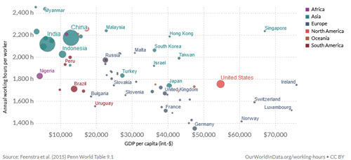
This report from Our World in Data shows that workers in richer countries work fewer hours because they live in more productive economies.
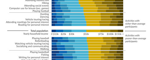
A long chart from Visual Capitalist shows how often leisure activities are enjoyed by U.S. residents in different income brackets.
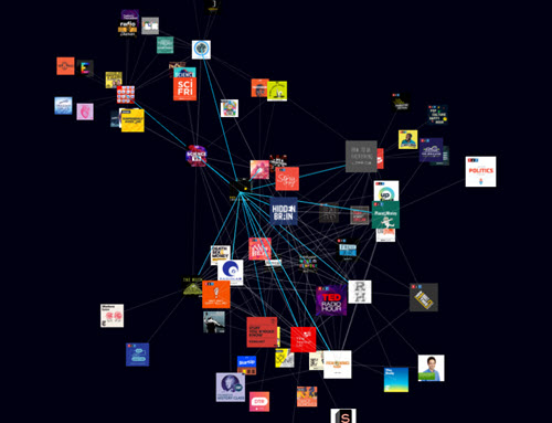
Type in the name of a podcast and this tool from Rephonic will give you an interactive 3-D network graph that illustrates which other shows the selected podcast’s subscribers listen to.