
Data Stories: Visualizations about Illness and Medication
These charts use data to shed new light on medical research, vaccine history, and opioid use.
- By Upside Staff
- November 13, 2019
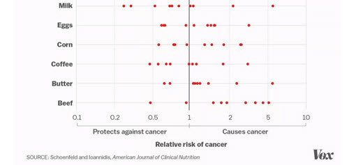
Medical research that is exciting enough to make headlines often turns out to be premature or unreliable. Read this article from Vox for several charts on the topic.
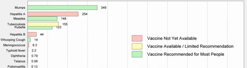
Scientist and self-proclaimed data nerd Robert Rohde created this animated chart that shows how the incidence of various diseases changed over time as vaccines became available. Pay attention to the way the scale adjusts at the bottom.
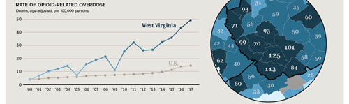
These charts from Visual Capitalist highlight notable trends and statistics concerning opioid use in the U.S.