By using tdwi.org website you agree to our use of cookies as described in our cookie policy. Learn More

TDWI Upside - Where Data Means Business

Data Stories: Fast Food Locations, Spurious Correlations, and French Fries

Where fast food is found, the impact of a visualization error, and comparing fried potatoes.


Need to Grab Something?

sample of data visualization, linked to full visualization at YouTube 

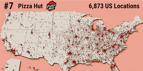
This video animates location maps for the most popular fast food franchises in the U.S.


Not Health Food, but Not Dangerous

sample of data visualization, linked to full visualization at Foodydata 

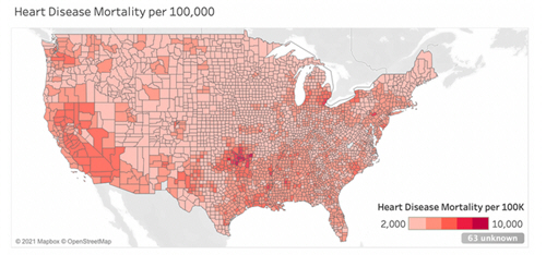
A popular visualization a few years ago proposed a link between Waffle House locations and heart disease. This article explains why using the wrong visualization type means that the original map is misleading.


Fries and Chips

sample of data visualization, linked to full visualization at Fry Universe 

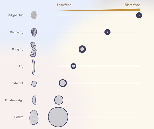
Scroll through this fun animated visualization to compare different fried potato shapes.


TDWI Membership

Accelerate Your Projects,
and Your Career

TDWI Members have access to exclusive research reports, publications, communities and training.

Individual, Student, and Team memberships available.