
Data Stories: Video Game Systems and Design
These data visualizations show the video game market over time, the growth of Nintendo specifically, and some fun stats about the original Super Mario Bros. game.
- By Upside Staff
- February 17, 2021
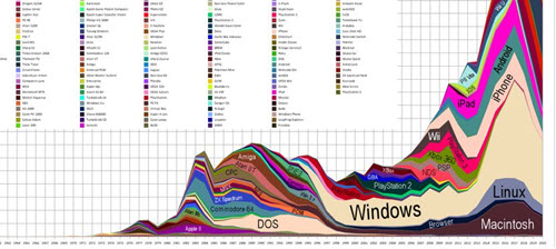
This chart from Moby Games depicts video games released over time by system. It’s too complicated to understand every detail, but it gives an impression of the scope and variety of the video game market.
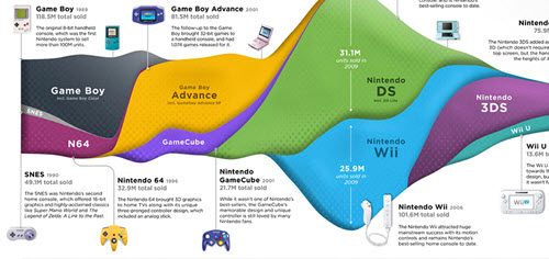
Visual Capitalist provides this infographic showing the rise and fall of each video game console sold by Nintendo.
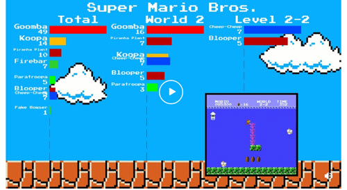
This fun animated visualization on Reddit shows the enemy placement in Super Mario Bros. You can watch how different enemy types are used to make the levels feel different and ramp up the difficulty over time.