
Data Stories: How to Create Better Data Visualizations
Read an article about data visualization failures, watch videos about different chart types, and learn what goes into creating a piece of data journalism.
- By Upside Staff
- February 3, 2021
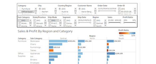
Tableau is very accessible data visualization software, but that doesn’t mean it’s immediately easy to use well. This humorous article goes over a few rookie mistakes and how to avoid them.
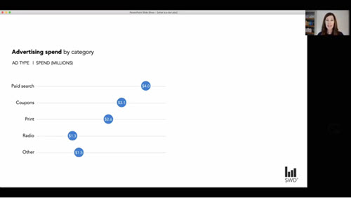
Author Jonathan Schwabish is currently producing and hosting a series of videos about charts starring data visualization specialists from around the world. Each short video describes the purpose of the chart, specific caveats about its use, and some basic design pointers.
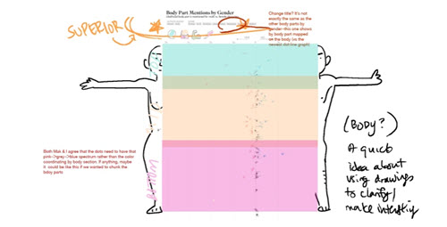
Creating a piece of data journalism isn’t easy. Data viz creator Erin Davis chronicles her journey from idea to finished piece in this blog post, including how the data collected for her first idea didn’t lead to an interesting story.