
Data Stories: Coronavirus Spread and Pandemic Travel
These visualizations model coronavirus risk and show how travel has been affected so far.
- By Upside Staff
- November 11, 2020

These evocative animations from El País illustrate new calculations of COVID-19 infection risk in various situations.
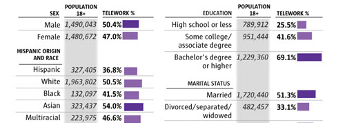
The Seattle Times provided charts that show how many people in that region have switched to remote work.
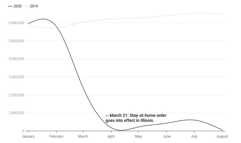
The Chicago Tribune created a number of charts that show the drop-off in car travel, air travel, and public transportation in the Chicago area this year.