
Data Stories: More Viral Visualizations
The biggest story in the news continues to be the spread of the novel coronavirus. View a range of dashboards, charts about impact, and other related visualizations.
- By Upside Staff
- March 18, 2020
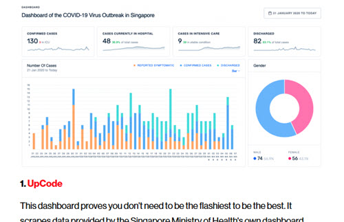
The coronavirus is the most popular topic for new visualizations online right now. MIT Technology Review looked at a range of related dashboards and rated the pros and cons of each.
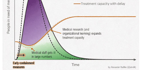
Watch an animated GIF on Flowing Data to understand the goal behind slowing the spread of infection.
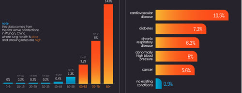
Information is Beautiful created this set of clear, colorful graphics about COVID-19; each chart has a specific focus.