
Data Stories: Exploring Cinema with Data Visualizations
Film is already a visual medium. What is gained by using data visualization techniques to compare quality, look at box office returns, and explore storylines?
- By Upside Staff
- October 9, 2019
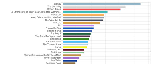
Don’t have all night to binge a new show? These fun charts plot the length of a movie against various measures of critical and financial success in an effort to find the highest quality versus duration. Change the selected metric with the tabs at the bottom.
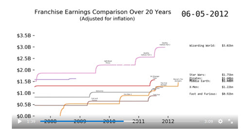
Have time for a whole series? This video animates the cumulative box office returns for various movie franchises over time.

Having trouble visualizing the scope of the Marvel Cinematic Universe? This colorful interactive chart shows how the major characters interact across the massive superhero film series.