
Data Stories: Time-Series Visualizations
A selection of ways to show data changing over time.
- By Upside Staff
- August 21, 2019
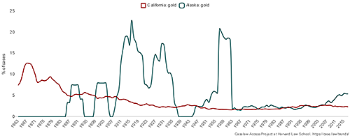
Harvard University's Caselaw Access Project has created a tool to display the frequency of words and phrases in the text of over the 218 years of accumulated legal decisions.
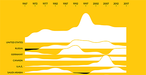
A look at what drives people to leave their country of origin from the experts at the International Migration Institute of Oxford University.
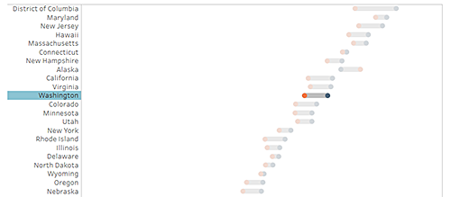
This prototype chart gives a quick look at the change in median household income from 2016 to 2017 by state.