
Data Stories: Troubleshoot Your Data Visualizations
Communicating data insights through visualization seems easy until you realize how common some errors are.
- By Upside Staff
- June 5, 2019
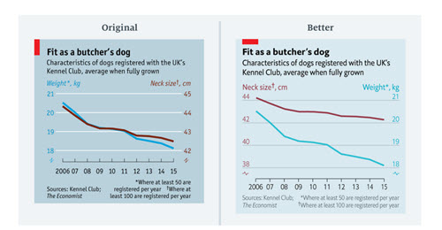
A data journalist at The Economist recently shared a collection of old charts that were published with misleading or incorrect visuals and demonstrated how she would fix them.
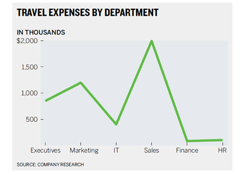
Even simple charts can go wrong. These examples show common mistakes made when using static charts and infographics, including when to definitely use (or not use) a visualization in the first place.
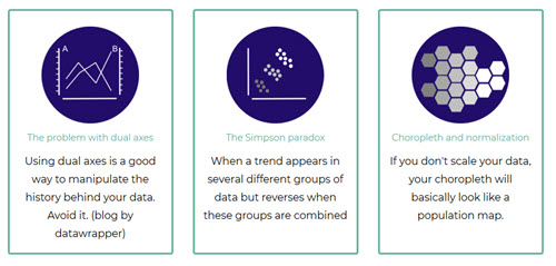
For more detailed advice, check out this list of data visualization caveats on data-to-viz.com. Many of the errors link to comprehensive articles with further guidance.