
Data Stories: Life and Death in Charts
These inventive visualizations compare the types of life on earth, simulate population growth, and explore the impact of celebrities’ deaths.
- By Upside Staff
- January 9, 2019
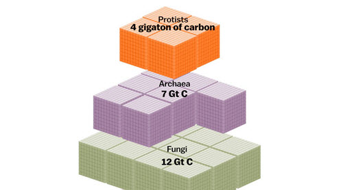
Vox.com used the data from a giant study in the Proceedings of the National Academy of Sciences to create this giant chart showing all the categories of life on earth by the weight of their biomass.
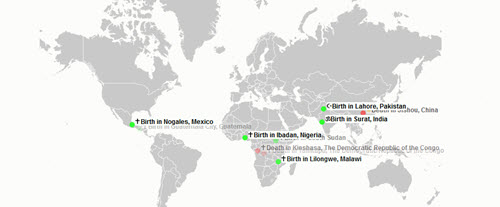
This statistical simulation dramatizes births and deaths around the world in real time. This article from The Atlantic gives more perspective and background from the visualization designer.
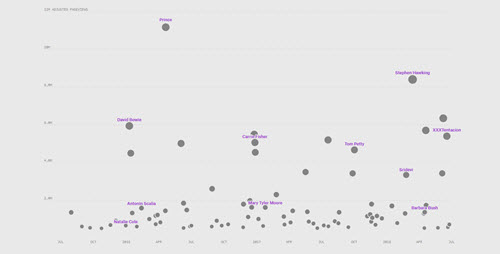
Scroll through this visualization from The Pudding to compare public reactions to celebrity deaths using spikes in Wikipedia traffic as a proxy data point.