
Data Stories: Salary, Rent, and Commuting
Data reveals many ways to map a country. These maps explore disposable income, variable rents, and megaregions around cities.
- By Upside Staff
- May 30, 2018
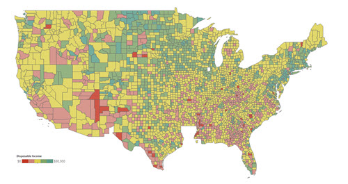
If you were considering the economy of a possible new home, you would probably balance the cost of living there with what you can expect to make. This series of interactive charts makes that explicit by finding the counties in the U.S. that should provide the most and least disposable income on average.
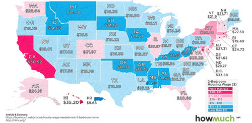
Another way to look at housing is to consider only the cost of rent. The above charts considered a single person renting a one-bedroom apartment; this map and article explore how much someone needs to make in each U.S. state to afford a two-bedroom home.
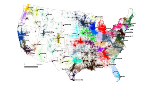
A study of commutes prompted researchers to produce these beautiful maps of the megaregions, i.e., “clusters of interconnected cities,” that make up the U.S. National Geographic explains the algorithms used to turn commuting data into plausible regions.