
Data Stories: Death, Disaster, and Pandemic
Data visualizations aren’t just for finance; we can examine questions about life-and-death scenarios. These charts show trends in mortality, coverage of disasters, and the potential effect of new vaccines.
- By Upside Staff
- May 23, 2018
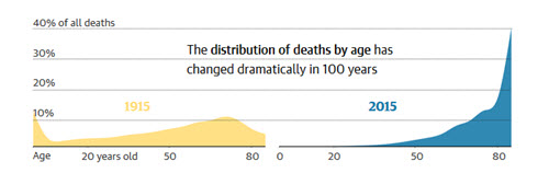
As healthcare changes, so do the common causes of death. The Guardian examined how the average lifespan has changed in the U.K. over the last hundred years.
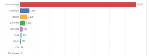
These charts from Our World in Data explore how the media cover different kinds of disasters. The data is from a study that shows more “spectacular” events get more coverage, even when many fewer people are hurt.
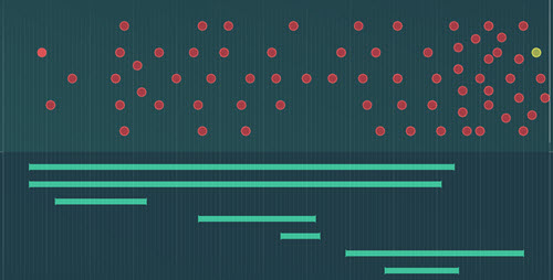
This example of interactive data storytelling is far from perfect; some aspects of the initial chart aren’t logical or explained. However, the visual choices are interesting, and it still successfully conveys a basic message about the impact of faster vaccine development for major diseases.